Principles as Families of Techniques
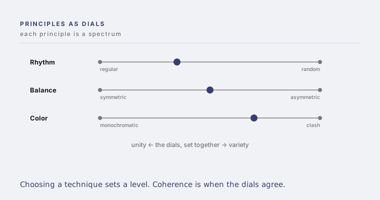
Each principle is a dial, and every technique is a setting on it.
Each principle contains many techniques, and each technique has a predictable capacity to add unity or add variety.
A principle is not a single move. It is a family of techniques, and the techniques are not interchangeable. They sit in order along the unity and variety continuum. Choosing one is not a matter of taste. It is choosing a position on a dial.
The principle
Every principle you can name resolves into a spectrum of techniques, from the most unifying to the most varying. Once you see the principle as a dial, design stops being guesswork and becomes navigation. You are not picking a treatment. You are setting a level.
Mechanism
Each lever has a known direction, and known stops along the way. Rhythm is the clearest case. It runs through four settings, from regular, the most predictable, to alternating, then progressive, then random, the most unpredictable. Pick the setting and you have picked your dose of tension before you place a single element. Balance runs from symmetrical to asymmetrical. Color runs from monochromatic to clash. Typography runs from uniform to highly expressive. Spacing runs from tight to fragmented. Movement runs from predictable to chaotic. Toward one end, unity and calm. Toward the other, variety and tension.
Why it matters
This turns a thousand small decisions into one coherent act. If you have chosen your position on the unity and variety line, every dial should be set near that position. Coherence is when the dials agree. Incoherence is when one lever is screaming variety while the rest whisper unity, and no one can say why the thing feels wrong.
Applications
Across every medium that has principles, which is all of them. A brand sets its rhythm, balance, color, type, spacing and motion dials. So does a product, a presentation, a building and an organization, whether or not anyone is reading the settings.
Examples
A bank holds nearly every dial toward unity: regular rhythm, symmetrical balance, monochromatic color, uniform type. A festival pushes them toward variety. The brands that feel confused usually have three dials at unity and one cranked to variety for no reason anyone chose.
Questions for leaders
For each lever we actually control, where is it set right now. Do the settings agree with each other. Where is one dial fighting all the others, and is that tension deliberate or accidental.
Practical implications
Audit your work as a set of dial readings. List the levers, mark where each sits on the unity and variety line, and look for the outlier. The outlier is either your one intentional spend of variety, or the reason the whole thing feels off.