Color
Every color choice is a position on the unity-variety line.
Color is not decoration. Every color decision communicates emotion, attention, structure, meaning, hierarchy, identity, movement and relationship at the same time.
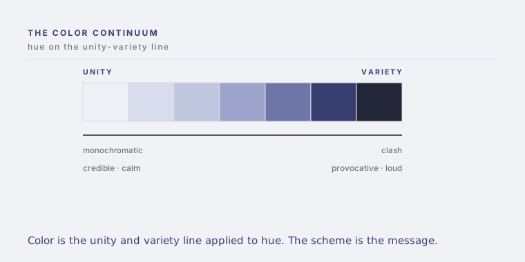
Color is usually taught as its own subject, with wheels and rules. It is simpler and more powerful than that. Color is the unity and variety continuum applied to hue. Every palette is a position on that line, and the position is doing emotional and symbolic work before a single word is read.
The principle
Color is a principle of design in its own right, the one that does the most emotional work with the least effort. And like every principle it is a family of techniques arranged along the unity and variety line. Color schemes run from maximum unity to maximum variety. Monochromatic, then analogous, then split complementary, then triad, then tetrad, then complementary, then clash. As the scheme moves toward variety, tension and energy rise. Each scheme carries two messages at once: a visceral one, felt instantly, and a symbolic one, learned by convention.
Mechanism
Near the unity end, color reads as credible, personable, soothing, reassuring, quiet, calm. Near the variety end, it reads as empowering, provocative, energetic, loud, urgent, agitating. The same key color, expanded toward unity or toward variety, produces opposite feelings from identical material. Choosing a scheme is choosing a temperature, a confidence and a level of arousal, not just a look.
Applications
Brand identity sets its position on the line and lives there. Interfaces use the variety end sparingly, to mark the one thing that matters. Wayfinding uses contrast to separate. Environments and products set a mood before anyone reads the sign. In every case, color is structure and emotion before it is style.
Examples
A monochromatic palette built from one blue reads as institutional trust: disciplined, reassuring, calm. The same blue pushed toward a complementary clash reads as provocation: loud, urgent, alive. Nothing changed but the position on the continuum, and the entire meaning changed with it. The scheme was the message.
Questions for leaders
Where on the color continuum does our brand sit, and is that the emotion we intend to project. Are we spending the variety end where it earns attention, or scattering it until nothing stands out. Does our color say what our words say.
Practical implications
Choose the scheme for the feeling and the unity and variety position you want, not for taste or trend. Then hold it. A color system is a promise about how much tension your brand carries, and breaking it quietly breaks the trust.