Victory

The Work at a Glance.

A fast overview of Victory: the strategy that reframed a recovery category, the identity built on it, and how that identity reached the customer.

Client
Covenant Eyes
Role
Creative Director / Head of Brand
Scope
Brand Strategy · Identity Systems · Product Architecture
Discipline
Strategic Architecture
Output
Recovery Brand Architecture

01Strategic Context

A category that sold surveillance, and the inversion that ended it.

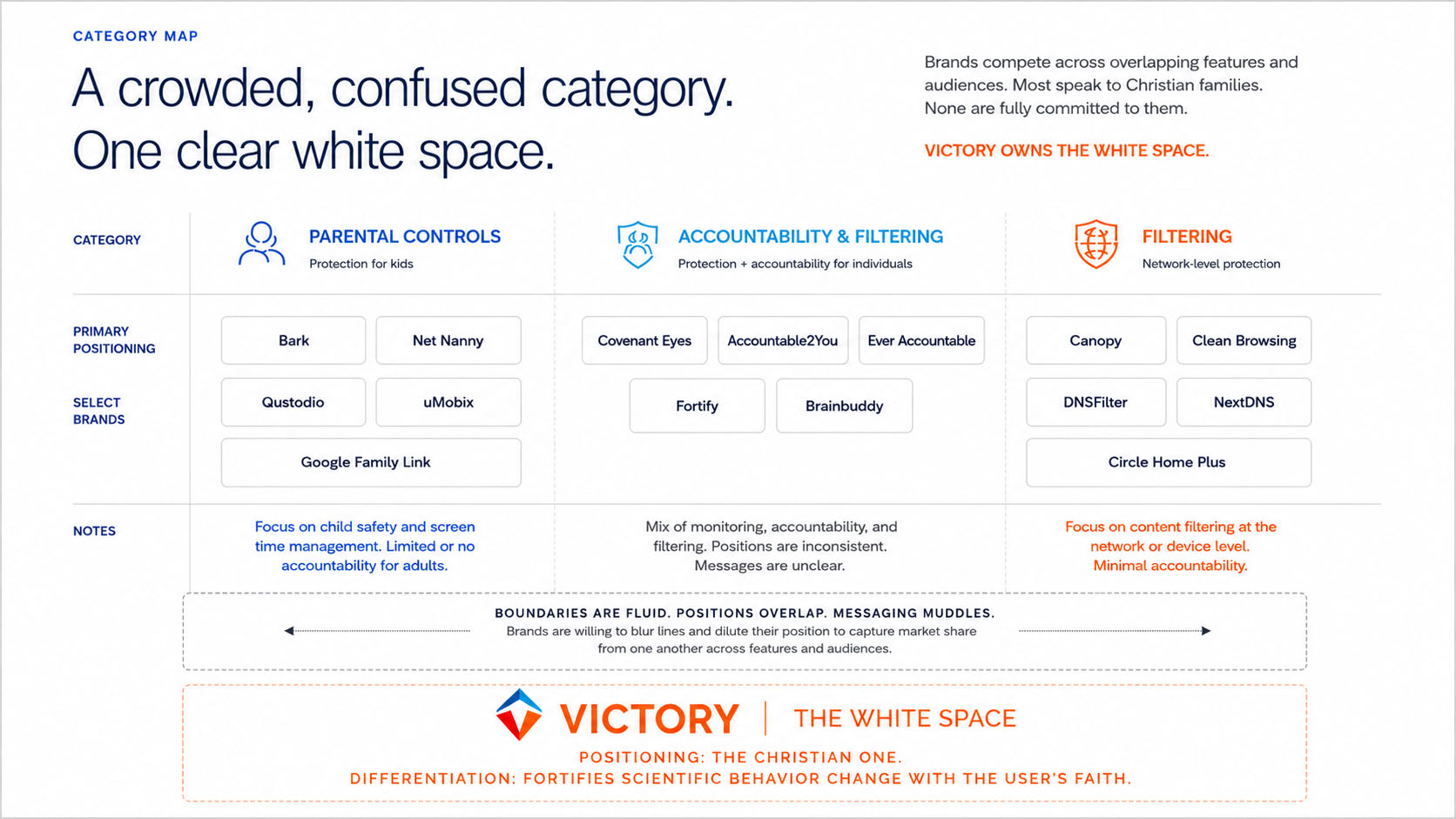
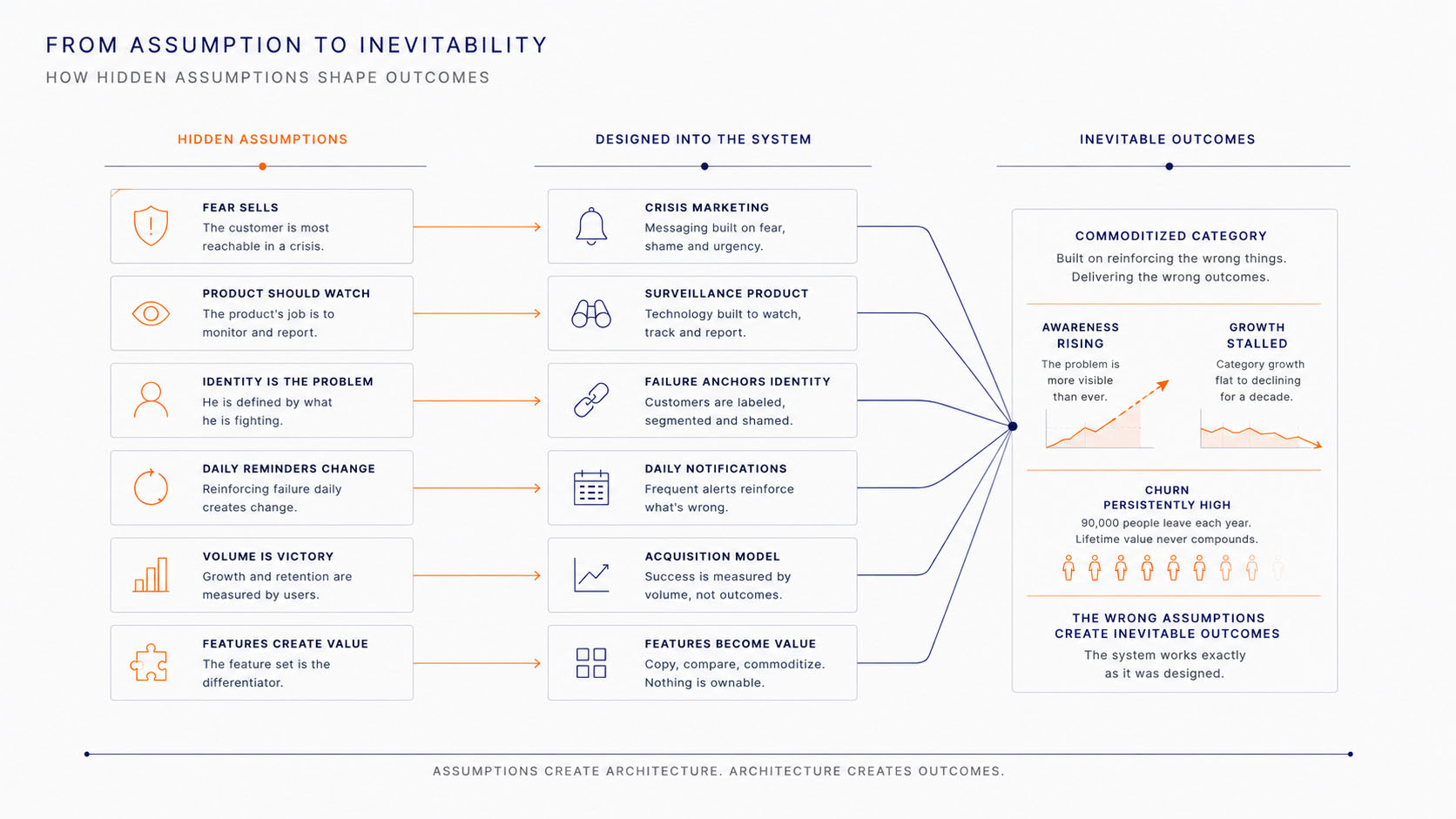
Covenant Eyes led a category built on monitoring and shame. Its product watched the customer and reminded him, every day, of what he was fighting. The icon in his pocket became a symbol of failure, and the relationship fit in a single sentence.

A man alone at night before a computer, head in his hand: the emotional state the category was built to sell.
Diagnosis · The state the category sold: “I can't wait to quit this product.”
~100,000
adopted each year
~90,000
left each year

Acquisition masked the experience. The category knew how to make people start and never learned how to make them stay. Ninety thousand men a year returned to the thing they came to escape.

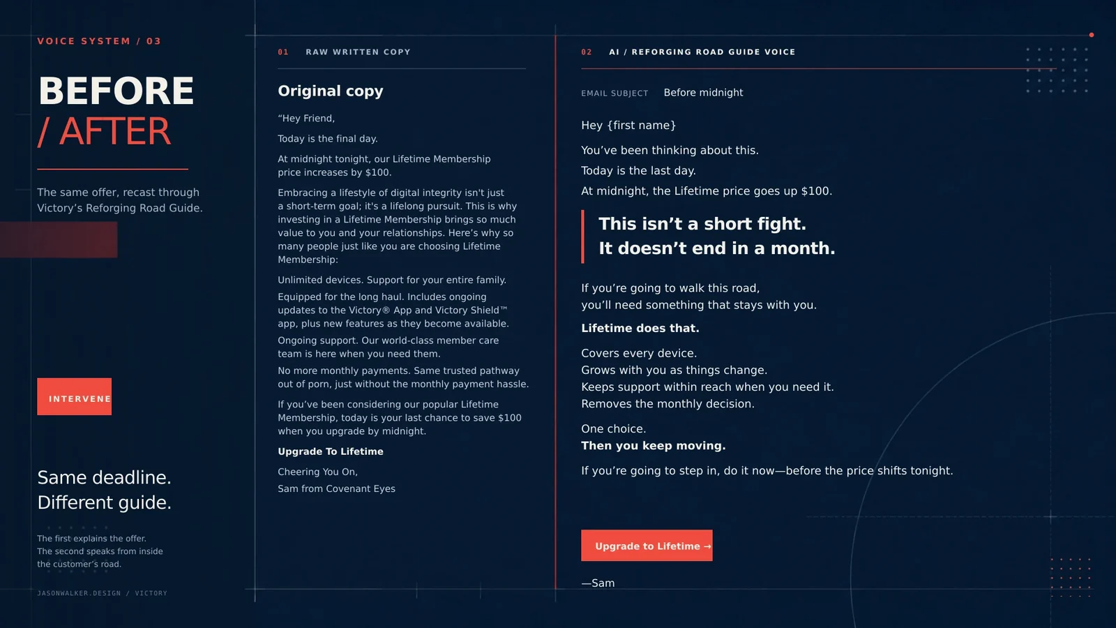
Rebrand the product to rebrand the customer.

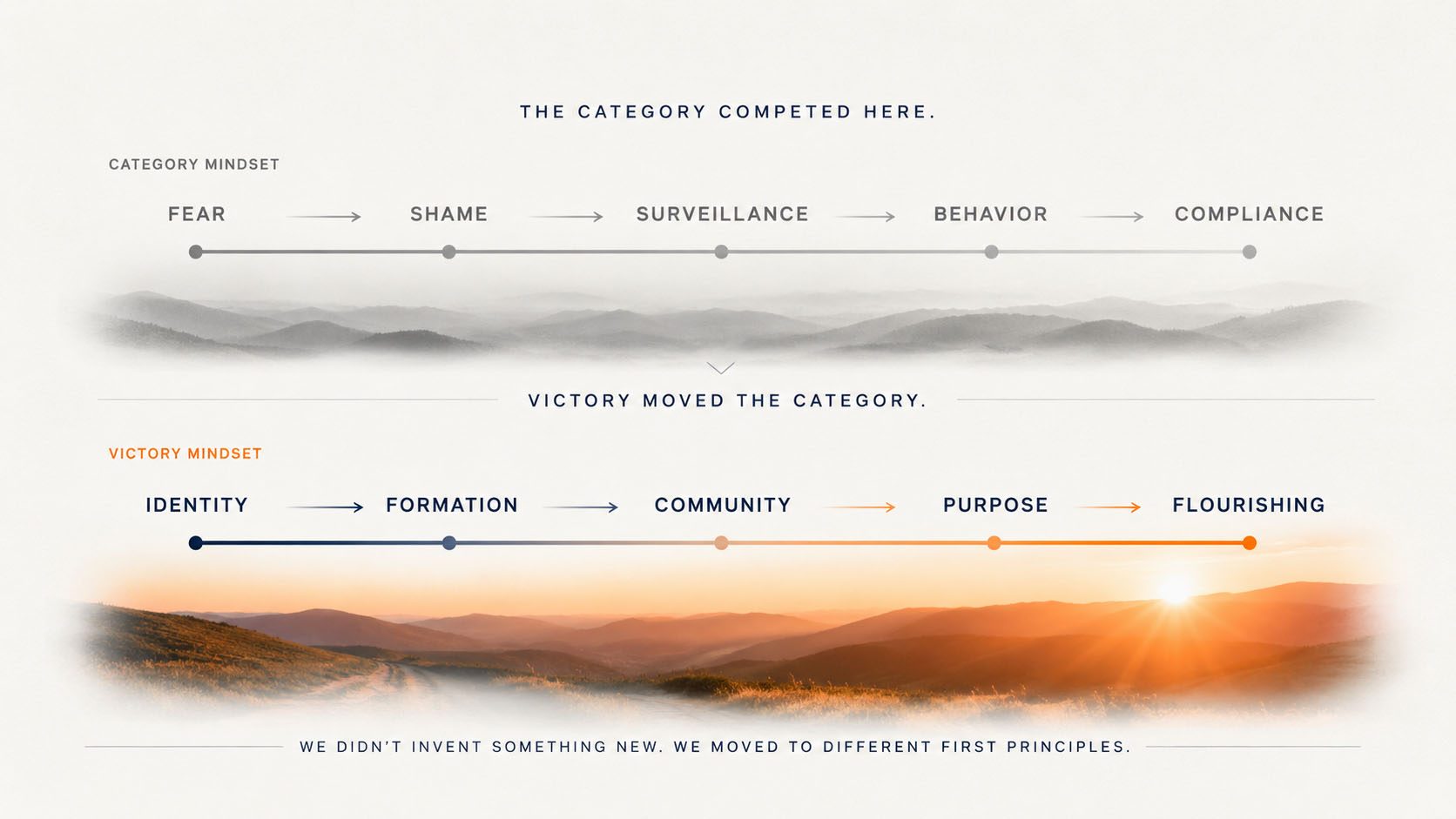
The category assumed behavior creates identity: manage the behavior long enough and the person will follow. Victory concluded the reverse. Identity precedes behavior. Form the person, and the behavior follows from who he now understands himself to be. That single decision turned a surveillance brand into a formation one.

Behavior is the evidence of transformation, never its engine.

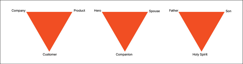
Inverting the category: each settled category assumption set beside the Victory conviction that replaced it, resolving into a new strategic architecture.
The inversion · From surveillance to formation

Doctrine Development

The framework beneath the inversion

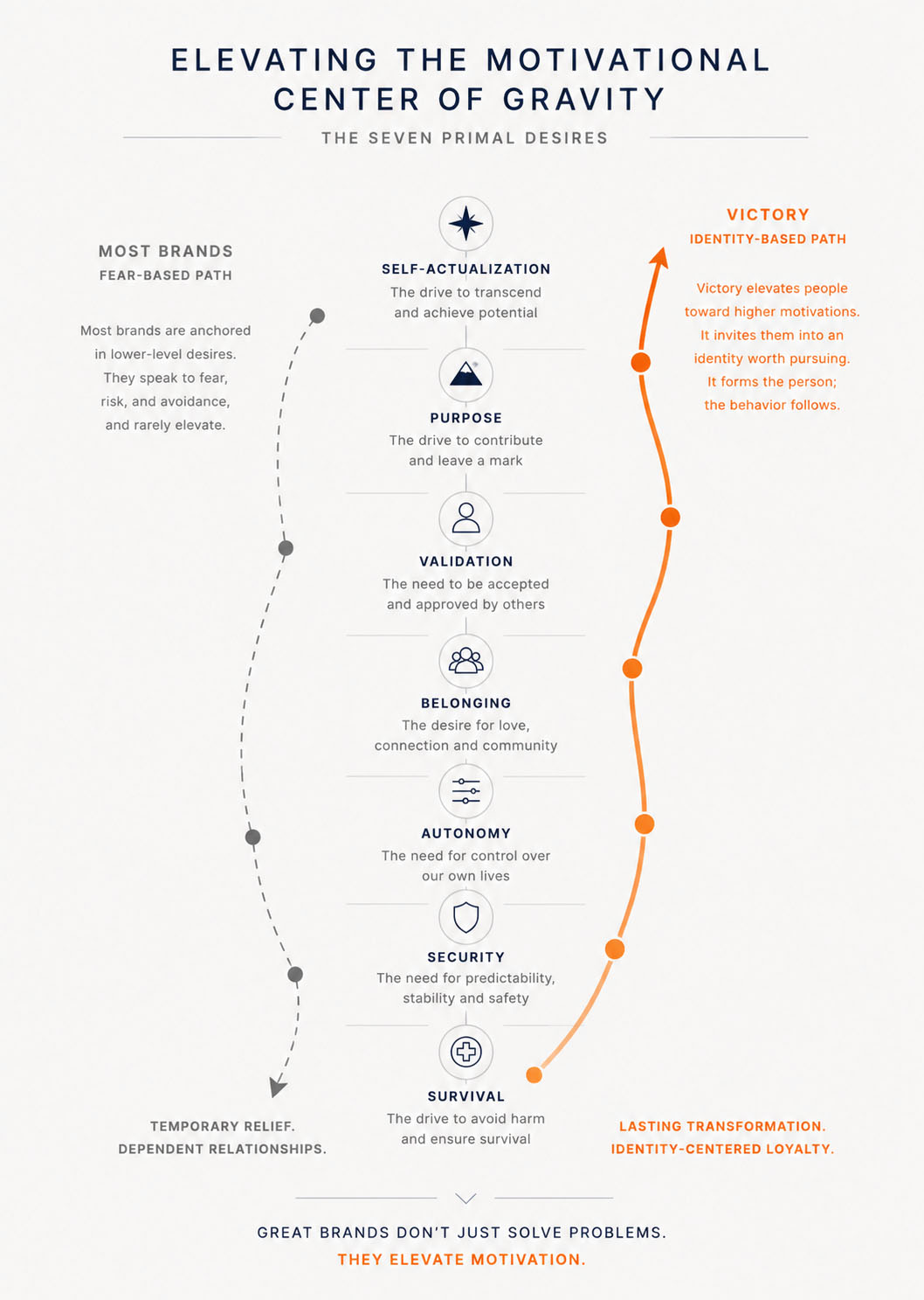
The decision to compete on identity rested on a model of human motivation. Tom Walker's Primal Desires Framework set out why brands grow stronger as they carry a customer toward higher motivations, and it shaped the guiding policy this chapter turns on.

First page of the Primal Desires Framework, shown as a printed book resting in the exhibit

02Project Context

Changing direction before changing the brand.

Covenant Eyes had no shortage of passion, ideas or conviction. What it lacked was a shared sense of how far a rebrand could go. Much of the thinking still treated branding as a better name and a cleaner logo on the same product.

The work raised the conversation to the category itself: whether a surveillance product could become a formation brand, and whether a customer defined by failure could be invited into an identity worth pursuing. That progression produced the central idea, rebrand the product to rebrand the customer, and with it a far larger possibility for the relationship between a customer and a product.

The shift did not arrive in one meeting. It was built across three onsites, and each produced a reference the organization kept using long after the room emptied.

Organizational Alignment

Teaching the organization to think about brands

Before anyone could debate a name or a position, leadership needed a shared language for brand architecture itself. I built the first workshop as a printed reference instead of a presentation that disappeared, and the CEO still reached for it years later when new questions surfaced.

First page of the brand-architecture reference leadership kept using, shown as a printed book resting in the exhibit

Strategic Decision-Making

One room, one day, one direction

For nearly four years, Covenant Eyes had debated competing positions for the brand's future. There was passion, there was conviction, and there was no shared direction. I brought every key decision-maker into a single room for one day, with one rule: no one leaves without a shared direction. That day resolved the four-year argument into two decisions the organization could finally carry together, and the book kept them working after the meeting ended.

Position · The Christian One

The only unapologetically Christian product in the category, serving a genuinely underserved market.

Differentiation · Faith as multiplier

Behavioral science remained the foundation. Faith became the multiplier, not a replacement for it.

This was the day Victory became inevitable. For the first time in four years, the organization knew who it was.

First page of the executive strategy framework that guided the decision, shown as a printed book resting in the exhibit

Leadership Communication

Building a team that could carry it

Direction at the top is not yet a team. A distributed group was brought together to become one, working from a shared story rather than a brief. The onsite book became their field manual for the months of work that followed.

First page of the brand-team onsite field manual, shown as a printed book resting in the exhibit

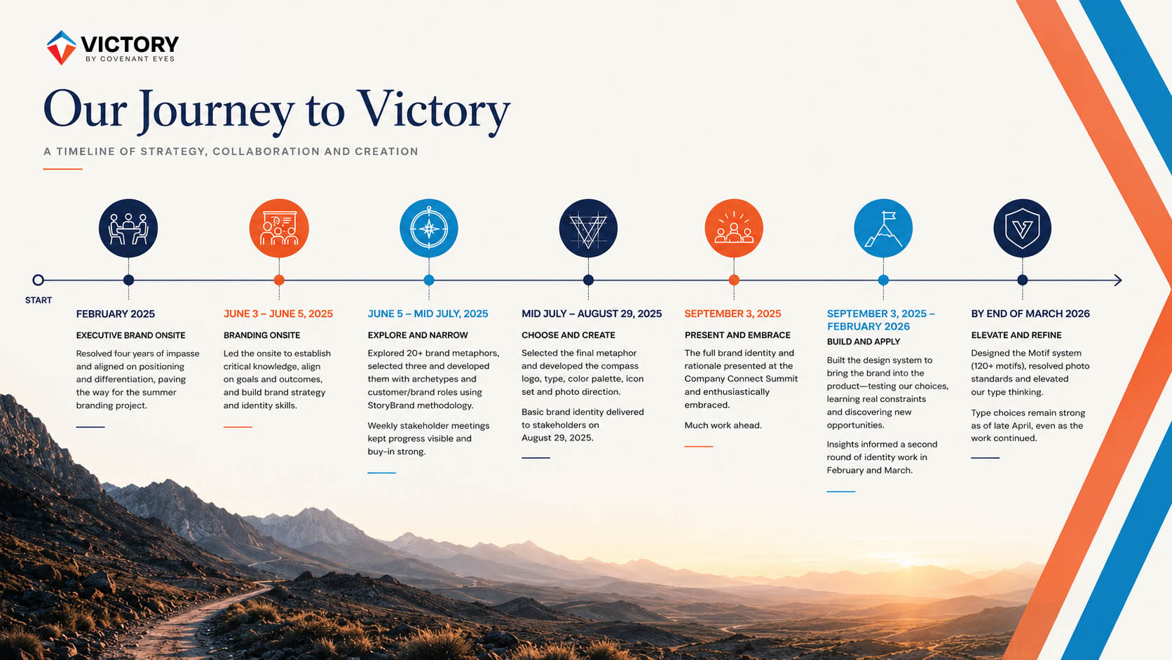
Leadership here looked less like authorship than stewardship: framing the right question, building the artifact that kept teaching after the room emptied, then trusting each discipline to answer it. The whole arc, from the first workshop to a living system, fits on one timeline.

A phased timeline of the Victory identity: strategic foundation in early 2025, identity discovery through the summer, company-wide adoption in September, and system expansion into 2026.
Leadership · From strategy to a living system

03Hero's Journey

People remember stories, not systems.

Alignment gave the organization a direction. What held every discipline together was a story the customer was already living. Victory chose to be the Guide who knows the road, never the hero who walks it.

An anonymous traveler climbing a hard, rocky road toward the light: recovery as a journey of perseverance and formation.
The Reforging Road · Recovery as a road that remakes the traveler

Recovery already felt like a road. The metaphor invented nothing. It gave shape to a reality the customer was already living.

A road has direction and demands movement. Reforging adds what movement alone cannot: metal is remade through repeated heat and pressure, never a single event. So difficulty stops reading as failure and starts reading as becoming. That is the difference between the category's promise and Victory's.

The Category

Manages behavior. Measures compliance.Progress is judged by tasks completed and standards maintained. Failure resets the score. Shame keeps people vigilant, while the product sits at the center as monitor, judge and hero.

Victory

Forms identity. Recognizes movement.Progress is measured by direction, not perfection. Small victories accumulate into something larger. The product steps out of the heroic role and honors the courage of the pilgrim who keeps walking.

You do not have to arrive to belong. If you are on the road, you are already moving toward Victory.

The Discipline

Work from the road.

Once the road governed the work, it became a place to design from. Every idea was measured against the customer's real experience, which kept the work close to the difficulty of recovery and ruled out the easy clichés: manufactured aspiration, false triumph, a sanitized picture of becoming.

The aim was truth, not darkness. The test was one question. Does this feel like it came from someone who has walked here? The goal was an experience that carried the scars and the wisdom of people who know the terrain, and who could help a traveler find the next step.

A lone man a few steps onto a long footbridge at dawn, the far side lost in mist, the distance ahead immense.
The next faithful step · Honest about the distance still to cross
The CategoryWorking from the road
Arms raised on a sunrise summit: the fantasy of arrival.
The category · Shows arrival
A long road still climbing, the summit out of frame: formation ongoing.
From the road · Honest about the distance ahead
A dashboard framed as transformation, the product cast as the hero.
The category · Makes the product the hero
Two men walking a road shoulder to shoulder, eyes ahead.
From the road · Lets the pilgrim carry the story
A hiker on a sunlit trail, stock-perfect and interchangeable.
The category · Idealizes recovery from a distance
A man with a backpack walking a winding mountain road at dawn, the road climbing toward far peaks.
From the road · Speaks with the scars of someone who knows the terrain

The road was never confined to the photography. It governed the language, the product, how progress was measured, how setbacks were read, and how small victories were recognized, so the whole experience stayed oriented around movement and formation. That is why the metaphor mattered strategically. It gave the organization one place to decide from.

The goal was to feel like we had walked the same road, and carried the scars and the wisdom to help someone find the next step.

04Identity System

The story, made visible and audible.

Identity is the last line of the argument, not the first. Logo, type and color each solve a different problem, and every one of them carries the same road.

The Mark

A relationship held in one form.

The mark came from the strategy. It holds the relationship between Covenant Eyes, the customer and Victory inside one simple form, and reads as a compass before any of that is noticed.

The Victory Journey primary mark: a compass-needle symbol built from a blue upper form and an orange lower form, with the wordmark beneath.

Journey · The primary mark

Symbolism

Three forms around a fourth that is never drawn.

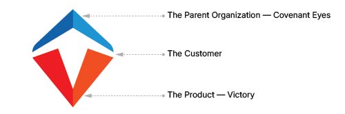
Three visible elements carry the argument, and the color is part of the meaning. The white between them is the customer, present only in the space the other forms leave for him.

Symbolic breakdown of the Victory mark: the complete mark at left, with dotted leader lines to three labels — The Parent Organization (Covenant Eyes) for the blue upper form, The Customer for the white negative-space figure, and The Product (Victory) for the red and orange lower forms.
Symbolic breakdown · Covenant Eyes, the customer, Victory

BlueCovenant Eyes

The organization, its history and accountability, guiding from above.

#1A94D2

WhiteThe customer

The figure in the negative space, still becoming and left undrawn on purpose.

#FFFFFF

OrangeVictory

The product and destination, the support and foundation beneath the customer.

#FF692E

The mark never draws the customer. It leaves room for who he is becoming.

The Victory mark's negative space on the orange Victory field: a white upward arrow that also reads as a standing figure and a path.

Negative space · An arrow, a figure, a path

The white reads at once as a person, an arrow and a path. It is direction and ascent, the customer in motion, placed at the center of the system rather than watched from outside it.

Construction

The discipline beneath the symbol.

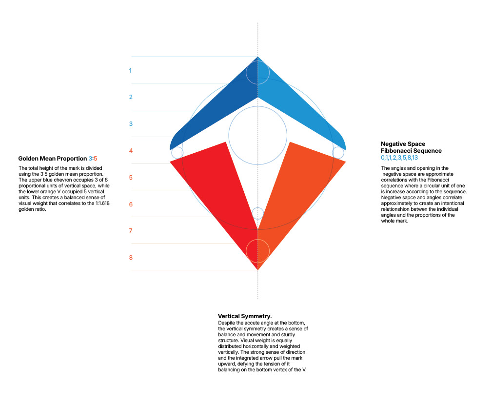
The mark holds together because its proportions agree. Read the height as eight equal units: the blue chevron takes about three and the orange V about five, a 3:5 relationship that steadies the whole form. Even the negative space answers to the same grid.

Proportional framework for the Journey mark: a vertical axis, mirrored geometry, construction lines and the eight-unit division that governs the form.
Construction · The proportional framework

The Mark System

Victory and Victory Shield.

The mark extends into a working family. Victory is the broader formation brand, the road the customer walks. Victory Shield is the protection and monitoring product inside that system, the capability behind the road. One says who this is; the other says what it does. Both share the same geometry and language.

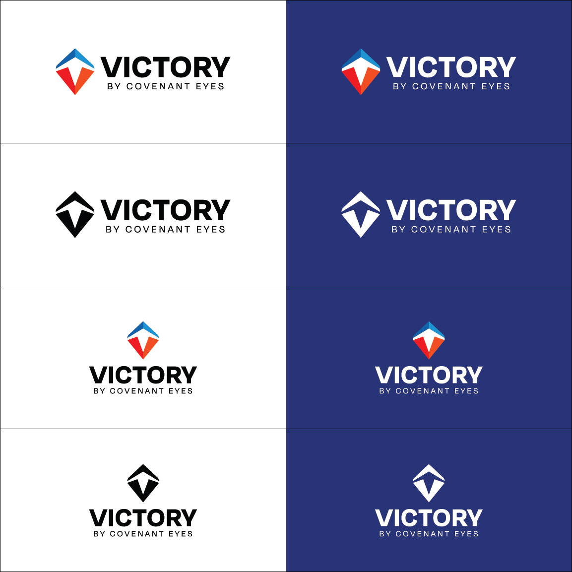
The complete Victory Journey identity family: primary lockup, horizontal and vertical lockups, icon and wordmark on a neutral field.

Victory · The formation brand

The complete Victory Shield identity family: primary logo, horizontal and vertical lockups, icon and wordmark on a neutral field.

Victory Shield · The protection product

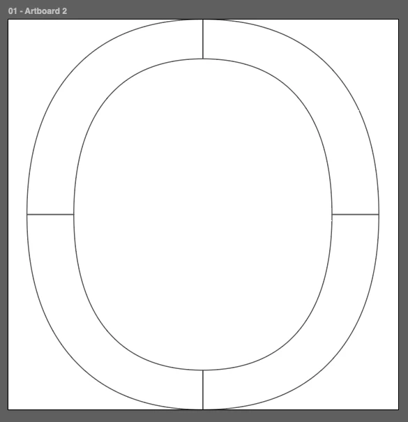
Typography was a trust decision before a taste one. A serif carries wisdom and a sans carries clarity: one accompanies the reader, the other organizes the screen. Neither performs the other's work.

Source Serif 4 and Public Sans shown as complementary roles in one system: the serif carrying wisdom and reflection, the sans carrying clarity and structure.
Typography · Two voices, one system

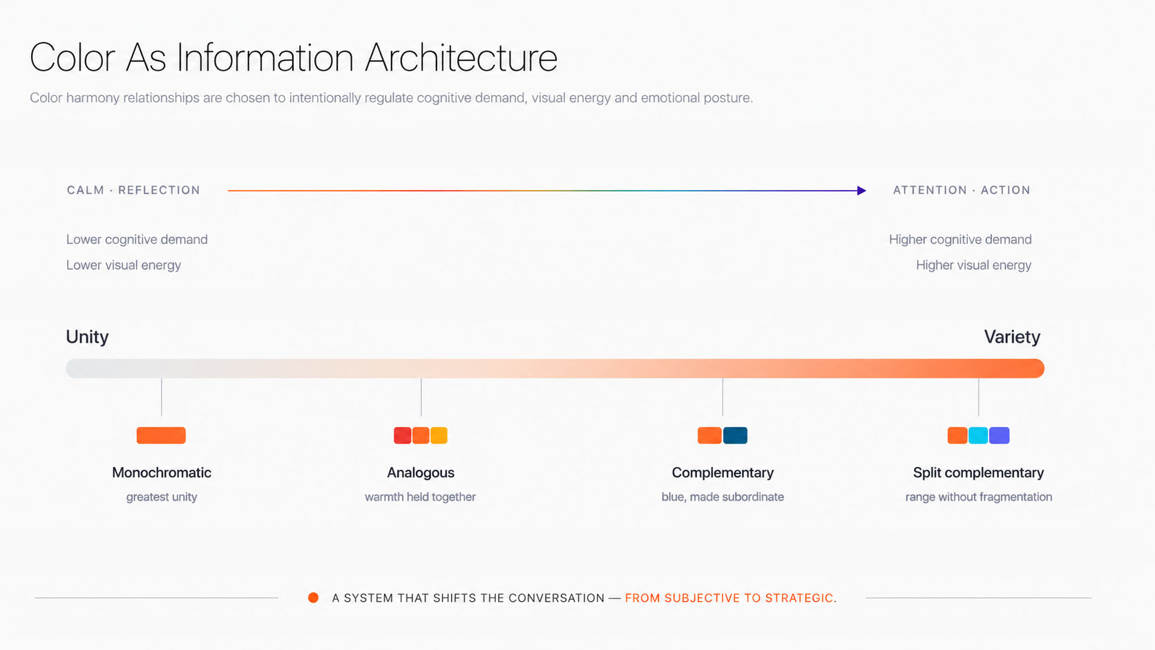
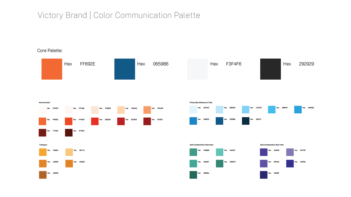
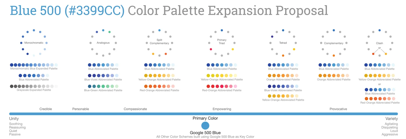
Color made the sharpest break. The category had quietly agreed on blue, where sameness signals interchangeable products. Victory chose orange: the color of becoming, the passage between warning and arrival, and a system where every relationship is chosen for the experience it creates.

The accountability category's palettes shown as a field of cool blues, with Victory's orange as the single warm outlier.
Convention · A category that agreed on blue
The Victory communication palette: orange at the symbolic center, balanced by blue and extended through split-complementary relationships.
Color · A palette built around orange

Identity Governance

The system, written down

The identity was never left to memory. It was documented as one reference the organization could return to, from strategy and voice through color, type, iconography and design grammar. Governance as much as design, so the brand keeps sounding and looking like itself long after the work.

First page of the Victory Brand Identity System, shown as a printed book resting in the exhibit

A shared story changes how people think. A shared metaphor changes what they build.

Available · 2026

Open to building work that holds the line.

Executive leadership for organizations creating genuine value for the people they serve. VP Marketing, Head of Brand, Director and senior leadership roles where strategy, brand, marketing and customer experience are treated as one discipline.

[email protected]