Brand Systems

Branding systems for the frontline worker.

Strategy has to survive the workday.

Frontline teams have calendars to ship and numbers to meet. If the branded choice creates friction, the workaround becomes the brand.

These systems put strategy inside the workflow on day one, so teams can move quickly without sanding away meaning. The logo carries the equity their choices create.

Victory as the proving ground

I developed this thinking through Victory, carrying one story into voice, color, form, motif and interface.

One film, eight chapters: the Victory triangle field resolves to a single orange triangle; it corrects a generic email into the Victory voice, word by word from the authored record; it becomes the construction tool that draws the approved social post on the 16 by 16 grid; the wider social system passes in review; the four color-scheme relationships populate the governed wheel; the Jost O becomes the icon library; and the material returns to the opening field.

Strategy / From intention to instruction

A standard nobody can execute is only a preference.

Frontline teams work against real deadlines. If the branded choice takes longer, the tactical choice wins.

Each workaround makes the next one easier until short-term production becomes the brand. Strategy has to arrive as usable systems on day one.

IF STRATEGY CANNOTARRIVE AT SCALE, TACTICSWILL REWRITE IT FORTHE NEXT DEADLINE.

Studio / The system in use

Brand expertise should feel like the easiest way forward.

Brand Studio is a vision prototype built to help frontline teams use a new brand from day one. Voice, color, type, motif and photography standards live inside the workflow, with the brand system guiding as the work is made. Teams can create branded content without memorizing a PDF.

Each system removes an arbitrary choice. Together they make meaning repeatable.

V1 · VISION PROTOTYPEA working concept for frontline brand creation. The intelligence shown here is authored and simulated.

Covenant EyesBRAND STUDIOBuilt for the work in front of you.

START A NEW PIECE

Begin with the brand. End with the work.

One decision at a time. Rough words are enough — the system narrows the choices as the brief becomes clear.

  1. 01Brand
  2. 02What you are making
  3. 03What it should accomplish
  4. 04The word it should strike
  5. 05Your rough content

    A sentence, notes or an unfinished thought is enough.

Not yet saved
Realized output / The content calendar

Fully realized, Brand Studio becomes the content-calendar workspace. Teams create, review and ship branded content across the system from one governed tool.

What the prototype produces / SocialBrand voice + color governance + motif grammar
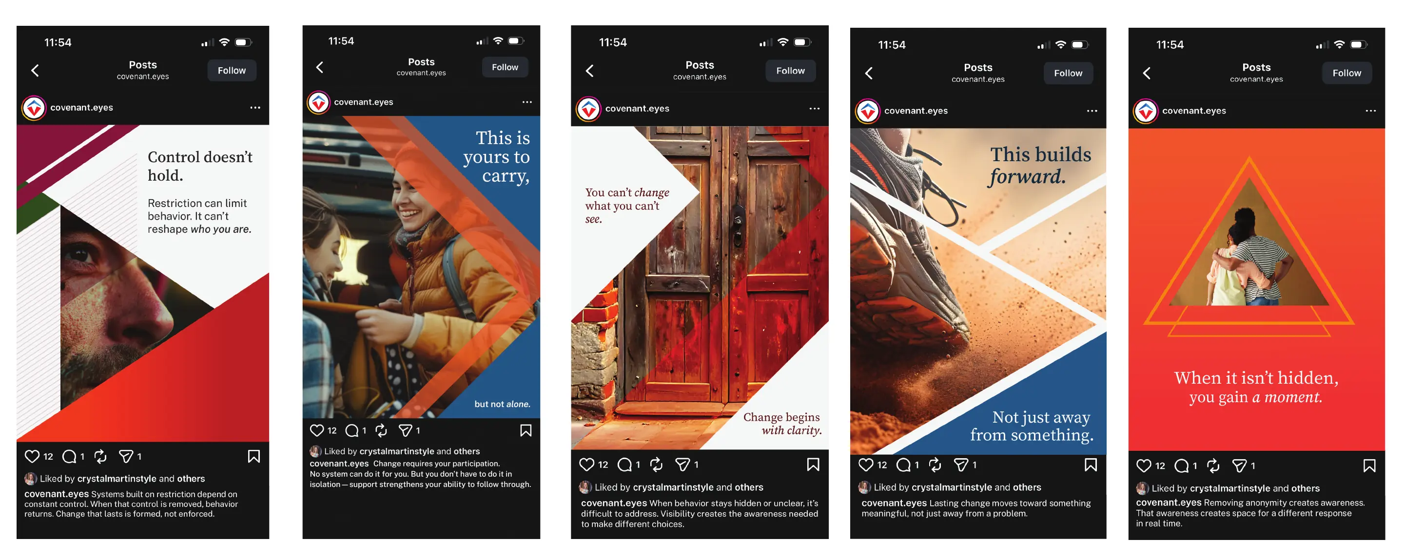
Five Victory social application studies combining Reforging Road brand voice, Victory color governance and directional triangle motifs.
Brand Voice / Posture at scale

The customer should feel believed in, not sold to.

Voice, color, type, icon, motif and interface are coordinated choices. Together they replace arbitrary execution with intentional brand behavior.

When tactics shape the language, the veil tears and the customer feels the transaction. The offer can remain. The posture has to change.

Keep the insight. Change the posture.

Thursday morning’s numbers matter. They are a byproduct of making the customer feel seen, heard and genuinely believed in. The Principles let many writers carry the same experienced Guide voice without surrendering editorial judgment.

WRITE FOR THURSDAYMORNING. BUILD FORTHE PERPETUAL MOTIONGREAT BRANDING CREATESDOWN THE ROAD.

Raw insight. Shaped, then judged.

The instrument / One communication

Watch the draft become the brand’s voice.

The Lifetime deadline email, carried through the whole process at reading speed.

Lifetime deadlineConvert a considered upgrade before the deadlineRAW INSIGHT

From Sam, Victory To Member

Type speed

Words before
151
Words after
94
Change
-37.7%
Editorial changes
16
Principles

Four more, the same way.

Same process, four other objectives. Open any one for the full review.

02

New membership

Start a paid Victory membership

Before

Hi {first name},

You’ve made the decision to quit porn. Now Victory by Covenant Eyes can help you follow through.

Victory is the leading quit-porn app for Christians, with powerful tools designed to help you break bad habits and find lasting freedom:

After

{first name},

You already know that trying harder doesn’t hold for long.

That is not the end of the story.

But it is the end of pretending willpower is enough.

Change needs structure:

Before
104
After
104
Change
0.0%
Changes
8
Principles
3
03

Reactivation

Reactivate a paid membership

Before

Hi Scott,

We’ve missed you.

Since you left, we’ve continued improving Victory to make it easier to stay accountable and protect every device. Your membership gives you access to Screen Accountability, porn blocking, activity reports, Check-ins, learning content and support from trusted Allies.

After

Scott,

I’ll be direct.

People step away when things feel steady, then find themselves back in familiar places.

Screen Accountability may have carried more weight than you realized.

If you’re still moving forward, keep going.

If you’ve drifted, don’t ignore it.

Small turns become direction.

Before
79
After
81
Change
+2.5%
Changes
8
Principles
3
04

Referral

Generate a referred trial

Before

Hi {first name},

Do you know someone who wants to quit porn?

Your personal referral link gives a friend 14 days to try Covenant Eyes free and adds a credit to your account. They’ll get powerful accountability tools, porn blocking, activity reports and access to the Victory community.

After

{first name},

You may know someone who is tired of making the same promise in private.

Do not send them a pitch.

Start with a conversation.

If they are ready to put something real in place, your link gives them 14 days with Victory and adds a credit to your account.

Before
85
After
100
Change
+17.6%
Changes
12
Principles
3
05

Missed check-in

Re-engage a member who went quiet

Before

Hi {first name},

Our records show you have not completed your weekly check-in.

Consistent check-ins are a key part of your accountability journey. Members who check in regularly are far more likely to reach their goals.

Log in now to complete your check-in and stay on track.

Complete Check-in

After

{first name},

The app went quiet this week.

Sometimes that means life got busy. Sometimes it means the week was hard.

Either way, you have not lost anything.

One check-in is not a test you pass or fail. It is a moment to be honest with one person walking the road with you.

Before
53
After
69
Change
+30.2%
Changes
4
Principles
3
Color / Intent made visible

Color is felt before it is explained.

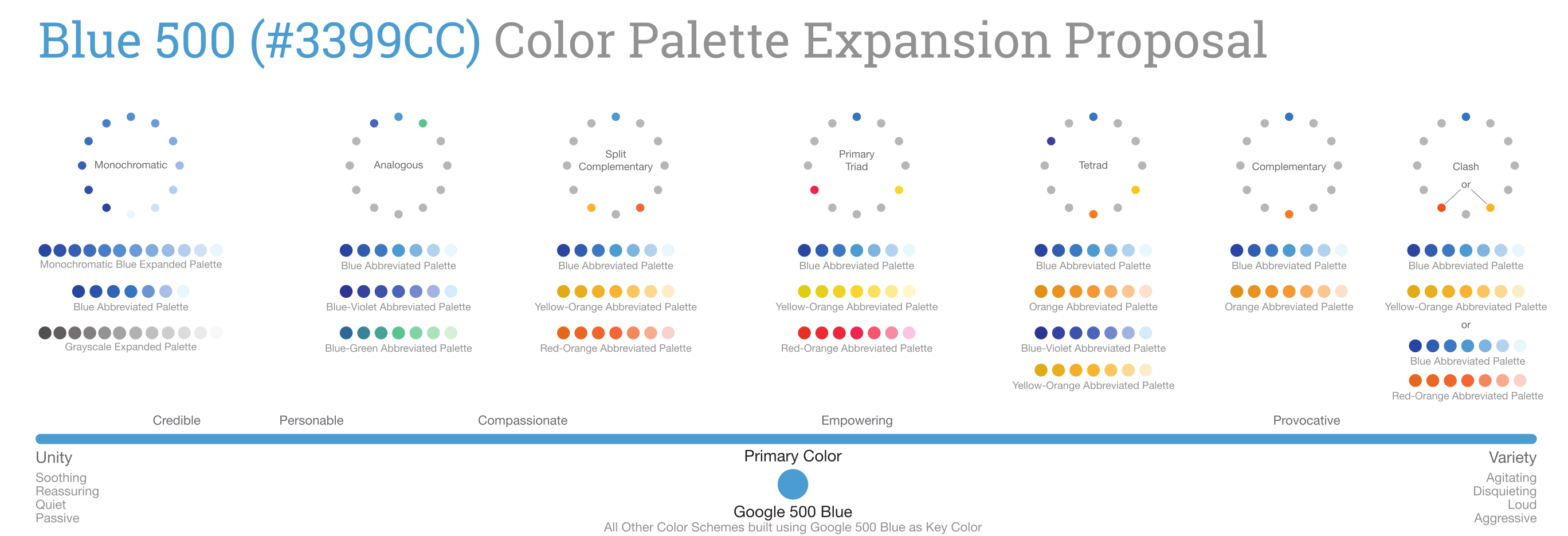
Harmony reduces what the eye has to process. Contrast raises the pressure. The Color/Tone Continuum aligns tonal language and color relationships on one scale, from quiet unity to active variety.

Teams locate the message, choose the cognitive pressure it should carry and apply the corresponding scheme. Verbal tone and visual tone become one decision.

COLOR IS VISCERALBEFORE IT IS SYMBOLIC.MOST BRANDS LEAVETHAT IMPACT ONTHE TABLE.

The original model / Color​/Tone Continuum

The original Color/Tone Continuum: tonal words and color schemes placed on one scale from least to most aggressive.
The original continuum placed tonal words and color schemes on the same scale, from least to most aggressive.
The original Color/Tone Continuum: tonal words and color schemes placed on one scale from least to most aggressive.
Fit

The original continuum placed tonal words and color schemes on the same scale, from least to most aggressive.

Palette / Controlled range

The palette holds the identity. The scheme sets the pressure.

Tints, shades and structured relationships move the same brand from quiet to active pressure.

Victory orange#FF692E
Victory blue#065986
Light neutral#F3F4F6
Charcoal#292929

Monochromatic orange

#FFF9F5
#FFF4ED
#FFE6D5
#FFD6AE
#FF9C66
#FF692E
#FF4405
#E62E05
#BC1B06
#97180C
#771A0D
#57130A

Primary blue, shades and tints

#E0F2FE
#B9E6FE
#7CD4FD
#36BFFA
#0BA5EC
#0086C9
#065986
#062C41

Analogous

#F4A52E
#F8C77E
#E18326
#AF6528

Split-complementary, blue-green

#409886
#64C3B7
#45A697
#368573
#29685A

Split-complementary, blue-violet

#8477B7
#4B3F99
#6154A3
#342F8B
#2B286F
The Victory implementation / Four relationships

One palette. Four levels of pressure.

Victory turns the continuum into four usable relationships: monochromatic, analogous, complementary and split complementary. Orange remains the anchor. Proportion controls the effect.

  1. Communication intent
  2. Tonal posture
  3. Cognitive pressure
  4. Color relationship
  5. Proportional application
VictoryYour plan

Member communication

This isn’t a short fight.

It doesn’t end in a month. If you’re going to walk this road, you’ll need something that stays with you.

Upgrade to Lifetime

Next check-inThursday
One composition. One set of words. Only the colour relationship changes.

ONE HUE. MINIMUM FRICTION.

One hue, its tints and its shades. Fewer differences to reconcile, so the field reads as settled.

Relative unity4/4
Relative variety1/4

Intended pressureQuiet

Chromatic allocation 100%

  • Victory orange#FF692E · 58%
  • Orange 300#FF9C66 · 24%
  • Orange 200#FFD6AE · 12%
  • Orange 1100#57130A · 6%

Best used forCare, reflection, reassurance, sustained reading

In practice

The team chooses an effect, not a favorite color.

The communication goal chooses the relationship. Judgment sets the proportion.
NeedRelationshipFelt effectConstant
MonochromaticLowest variety. Steady pressure.Orange leads.
AnalogousContinuity with direction.Orange leads.
ComplementaryOne clear point of contrast.Orange leads.
Split complementaryMore range. Controlled variety.Orange leads.
Type + Icon / One construction

One voice across type and icons.

Type and icons are made from the same ingredients and often share the same space. I build icons from the typeface’s DNA—its proportion, stroke, stress and dominant construction—so both feel chosen together and speak with one voice.

TYPE DOESN’T STOP WITH THEALPHABET. ICONS SHOULD BECUT FROM THE SAME CLOTH.NOW THEY CAN BE.

Anatomy / What the symbol inherits

The letter decides how the symbol is drawn.

Five families. Each icon is the letterform beside it, carried into a symbol.

GROTESQUE SANS

Public Sans

Variable, shown at 500

Direct grotesque construction. Open apertures, low stroke contrast, blunt terminals on a 24 unit grid.

O
Search

The lens keeps the O’s open counter and even weight. The handle leaves it on the same axis and ends on a flat cut.

HUMANIST SANS

Open Sans

Medium 500 audited

Vertically biased bowls with modulated stroke. Terminals flat and deliberate, never generic round caps.

O
Search

The lens is that O outline, unchanged. Its sides carry more weight than its top, so the living stroke survives into the icon.

GEOMETRIC NEO-GROTESQUE

Satoshi

Medium 500 audited

Broad counters and moderate vertical proportion. Flat terminals, decisive diagonals, rounds between geometric and grotesque.

O
Search

A wider counter and a heavier ring than Open Sans, so the lens reads bolder at the same size. The handle meets it square.

GEOMETRIC SANS

Jost

Medium 500 audited

Futura era discipline. Near circular rounds, close to monoline, sharp apexes and firm miters.

W
Arrow right

The W is four strokes meeting at points. The arrowhead is the same point, mitred the same way, at the same weight.

SQUARE TECHNO DISPLAY

Quantico

Bold 700 audited

Rectilinear skeleton. Curves become clipped bowls; the standard corner clip is 14 units across by 8.1 down, holding a 30 degree cut.

O
Search

Quantico has no circle. Its O is a clipped octagon with an open counter, and the search lens is built the same way: an outer form and an inner counter, every corner cut at 30 degrees, 22 units across by 12.7 down on the outside and 12.9 by 7.4 on the inside. The handle is the same rigid diagonal.

The construction rules, carried from the typeface

  1. Blunt, square terminals derived from Public Sans’ direct grotesque construction.
  2. Open apertures and generous internal counters for interface clarity.
  3. Low-contrast, even visual weight with calm rounded joins.
  4. A compact 24-unit grid, tuned to remain legible at 16–24 px.
  5. Neutral enough for system UI, but not anonymous: short hooks and firm shoulders remain visible.
Library / Fifty type-derived icons

Fifty symbols. One typographic logic.

A complete extension of the brand’s sans serif.

home
16
20
24
32
48
Motif / Direction made visible

The brand learned to point the way.

Victory is a brand about direction. A logo cannot say which way to go.

So the identity was given a second vocabulary: a 16 by 16 field, square edges and true 45 degree diagonals.

Movement, return, partnership, pressure and arrival become shapes.

THE ROAD BECAMEA GRAMMAR.

Construction grid / 05.1

Every mark starts on the same grid.

Positive moves forward. Negative returns. Dual holds both directions.

A 16 × 16 field and three diagonal systems gave designers a shared construction language.

Construction sequence Up Direction · Dual grid · 01 / 12
Layers

Positive moves forward. Negative returns or regresses. Dual holds both directions and supports the broader motif vocabulary.

Motif vocabulary / 05.2

Eight meanings. One grammar.

Each direction carries a defined narrative role.

Right Forward

Dual grid

Movement into open space. A decision made and acted on.

UseProgress, launch moments, calls to action.

Left Return

Dual grid

Movement against the reading direction. Reflection or a deliberate return.

UseRecovery content, history, looking back.

Up Ascent

Dual grid

Rising visual weight. Aspiration and moral elevation.

UseMilestones, encouragement, release.

Down Descent

Dual grid

Falling weight. Pressure, humility or decline.

UseWarnings, honest naming of struggle.

Up-right Recovery

Negative grid

A climb along the return diagonal. Ground regained after a setback.

UseRecovery content, coming back, restoration.

Down-right Momentum

Positive grid

Movement along the forward diagonal. Progress with weight behind it.

UseLaunch moments, decisive forward steps.

Pairings Companion

Dual grid

Two same-direction forms, one leading. Not alone on the road.

UseAlly features, mentorship, guidance.

Cluster Formation

Dual grid

Separate units held in one structure. Trinity and communal strength.

UseCommunity, belonging, collective identity.

Playbook / 120 motifs

The eight became a hundred and twenty.

The eight directions were the grammar. The playbook is the vocabulary it produces: 120 marks on the same field.

A designer under deadline does not need permission to invent. What they need is a page to point at.

Page120 motifs · 1429 vertices · 1365 segments

01 – 20The mark and the arrowThe triangle, the arrow and the chevron: the smallest statements of direction the system can make.

  • 001Single TriangleDirection
  • 002Hollow TriangleIntent declared
  • 003Split TriangleDivided purpose
  • 004Broken TriangleInterrupted progress
  • 005Rejoined TriangleRepair
  • 006Dense TriangleConcentrated force
  • 007Faded TriangleWaning resolve
  • 008Triangle with Circular CoreGuarded motive
  • 009Triangle on Circle BaseGrounded direction
  • 010Triangle Piercing CircleBreaking the cycle
  • 011Right ArrowForward
  • 012Left ArrowReturn
  • 013Up ArrowAscent
  • 014Down ArrowDescent
  • 015Up-Right ArrowRising progress
  • 016Down-Right ArrowManaged decline
  • 017Up-Left ArrowRecovery
  • 018Down-Left ArrowRelapse
  • 019Chevron UpStep up
  • 020Chevron RightNext step
Names are the package’s. The one-line meanings are read from the marks.

In service / Where the marks land

A vocabulary is only real where it is spent.

Four places the playbook is already carrying weight inside Victory. Nothing here was drawn for this page.

Victory compass lockup

Bearing

081Compass Point 082North Mark 118Road Bend

The compass sets the direction the member is pointed. Compass Point and North Mark carry that meaning at icon scale; Road Bend carries it when the direction has to change.

The Reforging Road framework

The road

048Path Line059Valley Form 060Valley Exit

The Reforging Road is the strategic frame. Path Line, Valley Form and Valley Exit are the three states of it a member is ever actually in, which is why they appear on the waymarks and in the product.

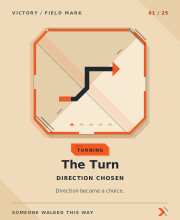
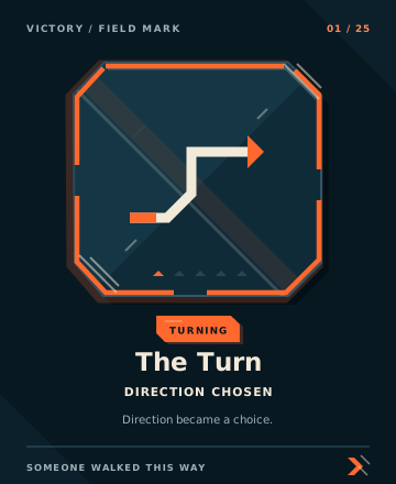
Victory Pilgrim Waymark 01, The Turn: direction chosen

The next step

011Right Arrow020Chevron Right 047Stair Through Gate

The waymark is issued the moment a member saves a private intention and one next step, and it is titled Direction chosen rather than Done. Right Arrow, Chevron Right and Stair Through Gate are the vocabulary that belongs to it, and they are the same three marks the product uses to point at whatever comes next.

Jason, I don’t really knowhow you bring brandinto the product.”— Ben, Product Designer

Product / Story in the interface

The story became a system for action.

Voice, color, type, icon and motif created one atmosphere of direction.

Features, taxonomy and states could all point to the next right step.

THE STORYENTERED THEPRODUCT.

The library / 50 component types

Fifty components. One grammar.

A shared library carries the system into routine product decisions.

Teams gain speed without rebuilding the brand screen by screen.

Restraint kept it credible.

Not every control needs to perform the metaphor.

Familiar patterns stay familiar. Brand meaning appears only when it clarifies action.

Return stayed part of the road.

Recovery should not look like failure.

Leftward movement signals reflection and re-entry, giving the customer another clear step without shame.

Free / Self-Guided

Ally Present

Pilgrim Waymarks / Marks left on the road

Someone walked this way.

The road needed evidence of people, not only systems.

Twenty-five Day and Night marks share one geometry, then retain enough irregularity to feel left by a human hand.

Night Road Wall
Waymark The Turn, Night Road Wall
The Turn
Direction chosen
High Sun Wall
Waymark The Turn, High Sun Wall
The Turn
Direction chosen
01 / 25 Turning

Product application / Day + Night

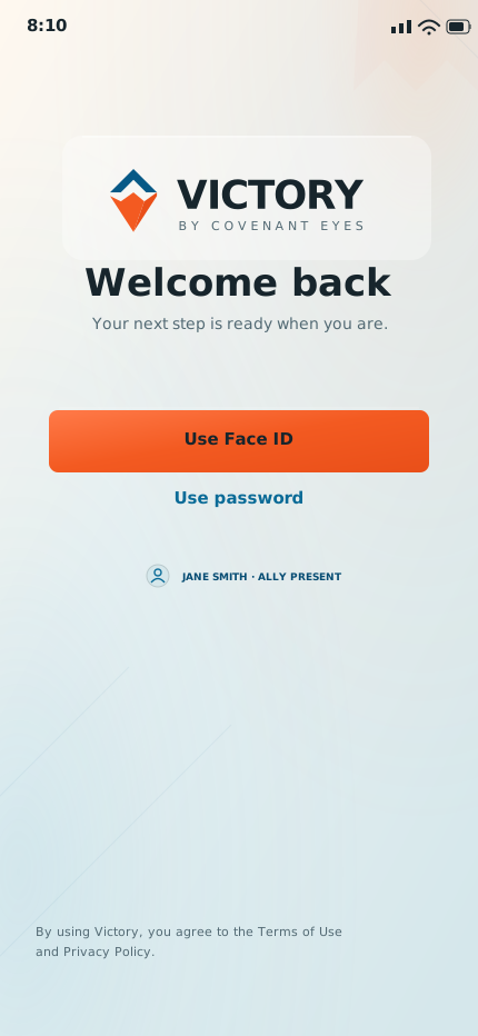
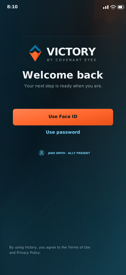
The story held at screen level.

Day and Night test the system where brand standards often disappear.

Color, motif, action and relationship remain coherent across both modes.

High Sun
Welcome back, High Sun
Night Road
Welcome back, Night Road
01 / 11 Welcome back
Outcome / The parts in one room

Coherence is the evidence that a system exists.

One early social test brought voice, color and motif into a single execution.

It is not a finished campaign. It is proof that daily work can reinforce one narrative.

THE PARTS BEGAN TOSPEAK TOGETHER.

First application test / SocialBrand voice + color governance + motif grammar
Five Victory social application studies combining Reforging Road brand voice, Victory color governance and directional triangle motifs.

An early application, not a finished campaign.

Jason, I never realized how muchhaving a story could impacthow I design a feature.”— Tim, Product Designer
Build the system

Build the standard into the tools people already use.

I design systems that help teams, tools and AI carry strategy into daily production without losing meaning.

Start a conversation

A standard survives when it makes the next right choice easier.