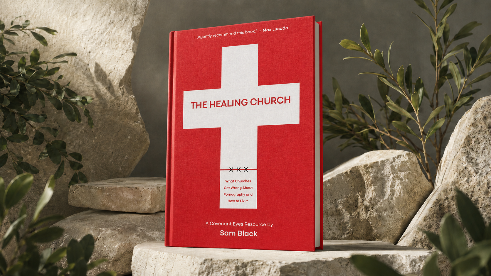
A cross revealed what safer Christian publishing conventions preferred to hide.
The Healing Church addressed pornography inside the church, but its identity could not disappear into the familiar language of Christian publishing. I built the book and campaign around one economical discovery: a cross and a concealed XXX occupying the same form. The mark made the church, the problem and the possibility of healing visible at once.
The Work at a Glance
It needed a symbol the church could recognize before anyone explained it.
Category gravity
Familiar colors, doves and devotional symbolism made difficult books feel interchangeable.
The opening
The title contained a visual contradiction: the church confronting what had been hidden inside it.
The flip
Combine the cross and XXX into one immediate, economical mark.
The system
Carry that discovery through the cover, publication identity, campaign and church outreach.

01Category Context
Blue, violet and gold. Doves and devotional calm. Safe before it was specific.
In this subject area the category signaled Christian book before it communicated the tension inside any particular one. The Healing Church had to address a difficult subject inside the church while still feeling credible, serious and unmistakably relevant to church leaders. That meant leaving the house style behind rather than decorating it.
Image or artifact coming soonish.
Image or artifact coming soonish.
02Identity Discovery
Recognition before explanation
A medical cross, a stitched square and three concealed Xs did the work of an entire argument.
The cover needed one form that could hold the book's whole argument without illustrating it. A symmetrical medical cross establishes healing. A square, joined to it by three visible stitches, extends that medical cross into a Christian cross. Those same stitches read as three concealed Xs, placing pornography inside the mark rather than beside it.
Nothing is added as decoration. The church, the treatment and the subject being treated share one economical form. The cover presents the church as a place where pornography addiction can be confronted and healing can begin, without reaching for the blues, doves and light rays the category uses to look devotional on the shelf.
03Publication System
The discovery did not stop at the cover. It set the typographic system, the interior structure and the identity that let the book read as one coherent object rather than a decorated jacket. The same restraint that made the mark work governed the pages behind it.
Image or artifact coming soonish.
Image or artifact coming soonish.
04The Porn Tax
From book to campaign
The Porn Tax made an invisible consequence difficult to dismiss.
The identity became the foundation for The Porn Tax, an integrated campaign and national book-tour platform. It gave church leaders a provocative way to introduce the subject across youth, men's, women's and couples ministries while keeping the book at the center of the conversation.
The Porn Tax made the hidden cost of avoiding pornography visible across the ministries expected to address it.
05Ministry Expressions
The campaign carried the book into the ministries that make up a church. Youth, men's, women's, couples and marriage counseling each received an expression tuned to its audience and the leaders responsible for serving them.








06Outcome
Within about six weeks of launch, the campaign and national tour placed nearly 20,000 copies of The Healing Church with churches across the country, carrying one coherent idea from the cover into ministry conversations.
Nearly 20,000 copies delivered to churches nationwide in about six weeks.
Executive leadership for organizations creating genuine value for the people they serve. VP Marketing, Head of Brand, Director and senior leadership roles where strategy, brand, marketing and customer experience are treated as one discipline.
[email protected] →