Journey Brand System
Not a style guide. The reasoning that made the style inevitable.
Victory was never meant to be a better accountability app.
It set out to change the relationship Christians have with recovery. That ambition ruled out the usual starting points. The work could not begin with a logo. It had to begin with a question.
Everything that follows is the answer, in the order it was discovered. It begins with a diagnosis.
Start with the man, because the design had to. He arrives tired in a way sleep does not fix, worn down by failing in the same place again, thirsty for the very thing that would undo him. He fears that telling the truth will cost him the little trust he has left. He is not an ideal customer; he is a person at the end of his own answers, taking one more chance. Every constraint below is measured against him.

Figure 01 — At the End of His Own Answers
The conditions the design had to satisfy
Before any creative decision, the answer was already narrowing. Several forces pressed at once, and each led to the next.
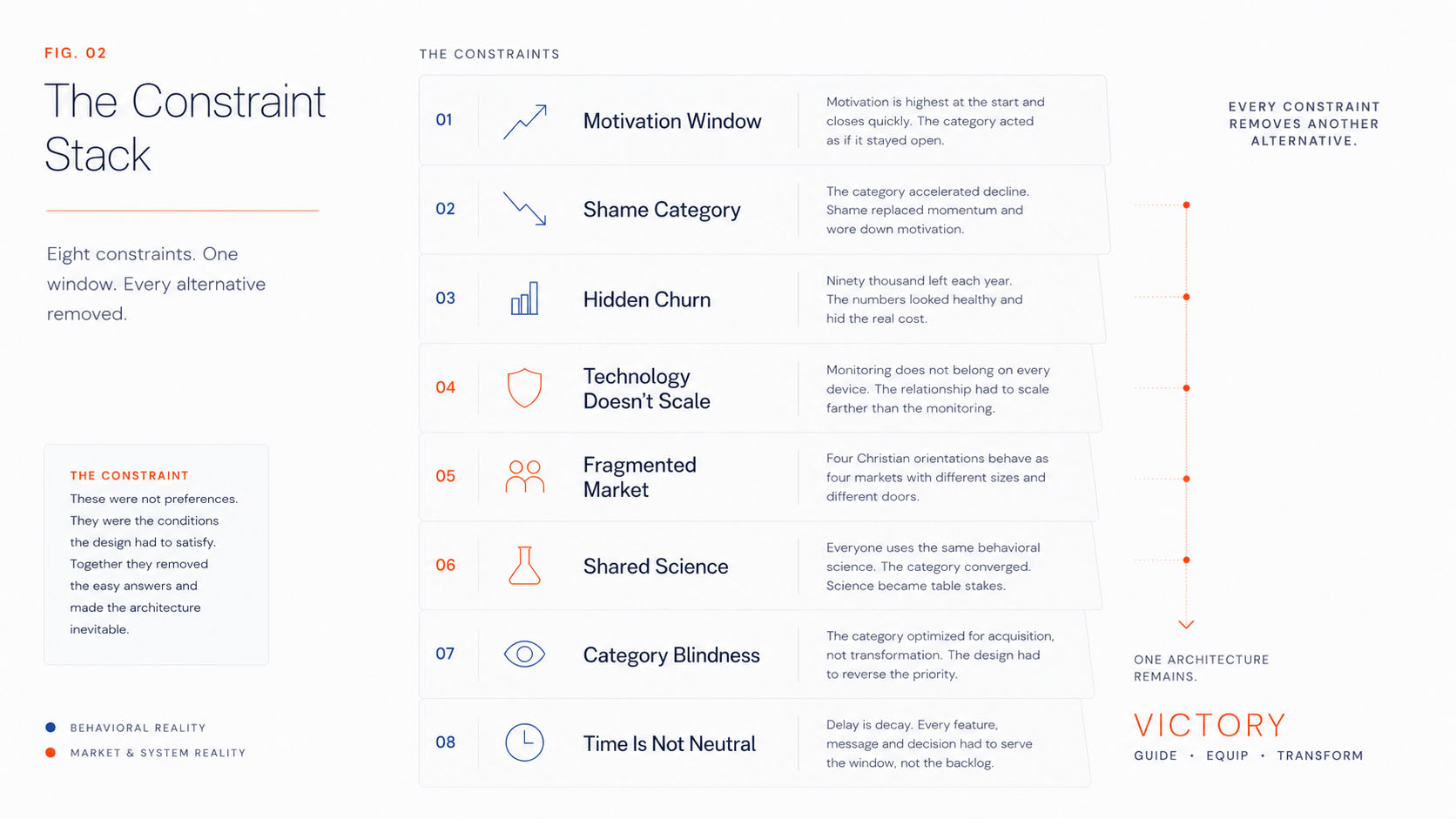
Figure 02 — The Constraint Stack
Motivation is highest at the start
Customers do not arrive with low motivation. They arrive having just crossed one of recovery's hardest barriers, by choice or by force, at maximum pain, hope and willingness to change. It is the moment change is most possible, and it is temporary: a window that opens when someone begins, then closes. The category behaved as if it stayed open.
The category accelerated the decline
Legacy products reminded the customer of failure at every turn. You struggle. You failed. You must be watched. The product became a daily symbol of shame, wearing down what motivation remained. The relationship fit in a sentence: I can't wait to quit this product.
The reason ran deeper than fatigue. An accountability product lives on the phone and is opened many times a day, and each encounter repeated the same quiet verdict: here is the thing you keep failing at. It never came to stand for who the man was becoming; it stood for what he was fighting, so the icon itself became a beacon of shame he carried in his pocket. Belief in it drained a little with every reminder, until he was no longer looking for a reason to stay but for permission to leave. What began as dependence had quietly become the wish to escape.
“I can’t wait to quit this product.”

Figure 03 — The Thing He Can't Wait to Quit
The economics told the truth
The business looked healthy; the numbers hid the problem. Acquisition was masking experience. The organization knew how to make people start, never how to make them stay.

Figure 04 — The Category Trap
Ninety thousand is not a churn figure. It is ninety thousand men who returned to the thing they came to escape. The number says little about them and everything about what they were leaving.
The real cost of failure
The category measured churn. Families experienced absence.
People did not simply abandon a product. They gradually abandoned the life they hoped the product would help them recover. Isolation rarely arrives all at once. It accumulates quietly. Attention narrows. Relationships weaken. Presence gives way to distraction until the people closest to them begin living with someone who is physically present but increasingly absent.
The tragedy was never that someone stopped using a product. It was that they stopped becoming the husband, father, wife, mother, friend, or leader they hoped recovery would restore.
Recovery was never only about stopping a behavior. It was always about returning someone to the people who needed them most.

Figure 05 — The Ones Who Went Back
The Blue Box
Three facts now sit together: motivation peaks at the start, the category speeds its decline, and the numbers show the cost. Together they reveal an opening, a narrow window after conversion when a person is most willing to build lasting habits. Victory designed around it.
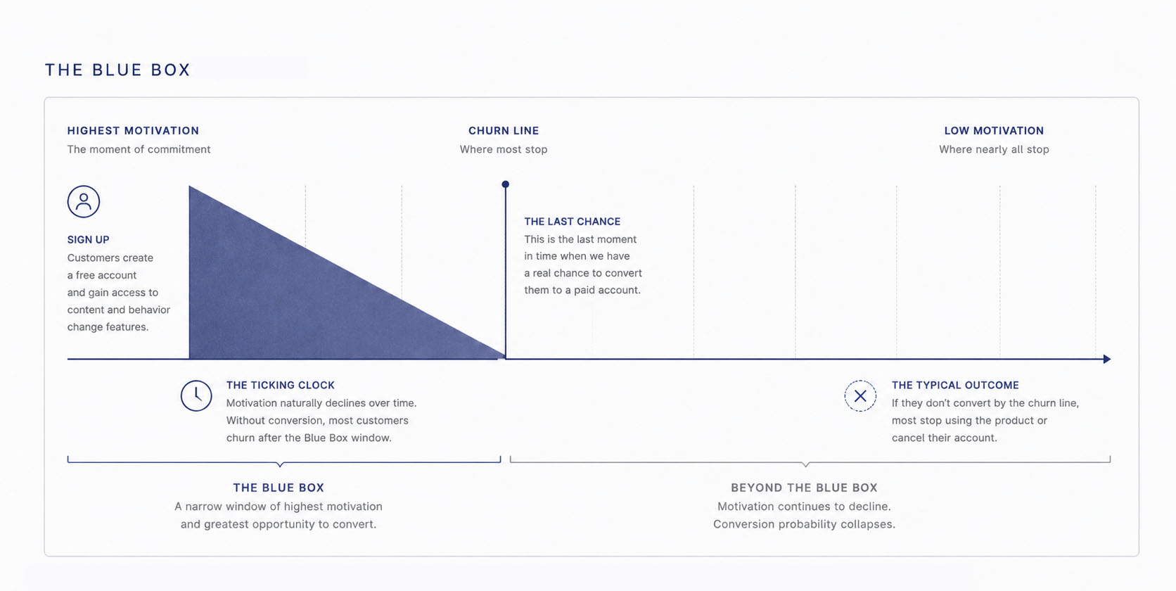
Figure 06 — The Blue Box Behavioral Window
Victory called this window the Blue Box, a behavioral insight the product was built around long before any story or logo existed.
The technology resists its own scale
The monitoring at the center of the category is invasive and operationally heavy; it belongs where it serves the journey, not on every device. The Pilgrim may need Victory Shield and its active accountability. The Companion usually does not. Both need Victory: the Guide, the shared language, the relationship. So the relationship had to scale farther than the monitoring, which meant separating the two.

Figure 07 — Victory and Victory Shield in Everyday Life
The market was not one market
The audience that looked unified divided the moment you tried to reach it. The four Christian orientations behaved as four markets, each with its own size and its own door.
| Audience | As a market | How it is reached |
|---|---|---|
| Active | The strongest existing market | Church-based channels |
| Liturgical | Adjacent · different institutional behavior | Tradition and church structures |
| Professing | Significant future growth | Harder to reach through the church |
| Private | Significant future growth | Least institutional · direct and social |
The strongest market was already in the pews; the growth was not. Reaching the Professing and Private audiences ruled out leaning on the church, pushing the strategy into social and direct channels.
The science was already shared
Every serious product drew on the same behavioral science: the same habit loops, triggers and streaks. Everyone adopted what worked, and the category converged. It was selling recipes, and recipes are interchangeable.
Behavioral science had become table stakes. Whatever set a brand apart would have to come from ground the category was not yet working.
Read together, the constraints did not merely complicate the design. They removed the alternatives.
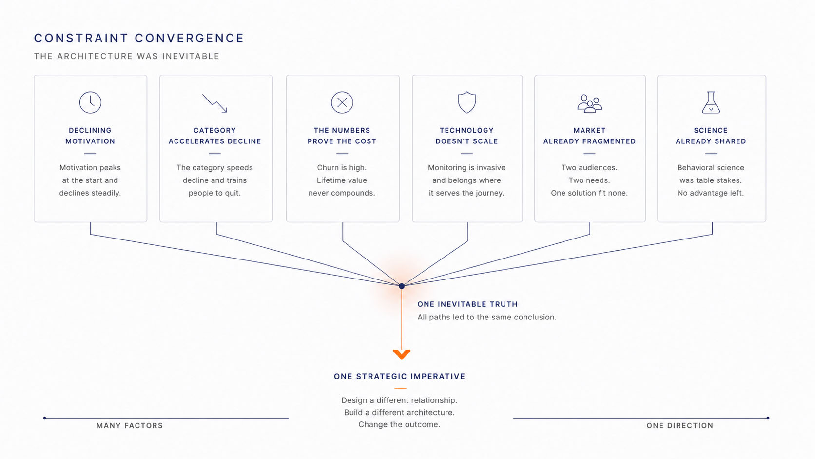
Figure 08 — Constraint Convergence
A motivation window that closes. A category that hastens it. Churn, a technology that resists scale, a shared science, a market beyond the church. None of these was chosen; all were given. Together they ruled out the easy answers and pointed to one. The next chapter asks why.

Figure 09 — The Reforging Road
Reading the evidence backward
The conditions in the previous chapter were not unrelated facts. Read backward, they converge on a few assumptions the category had stopped questioning, defaults so settled that no one inside the category felt them as choices. Trace each one forward and the outcomes stop looking like misfortune.
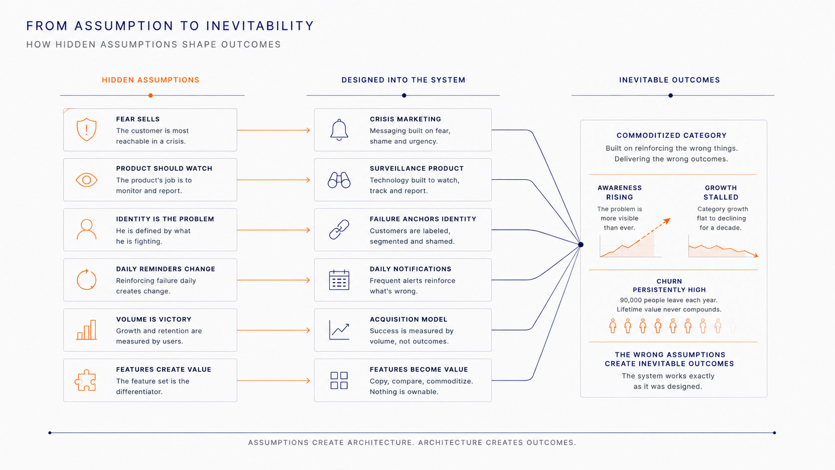
Figure 01 — From Assumption to Inevitability
Begin with the most visible. The category assumed accountability sells best through fear, and that a product's job is to watch. A product built to watch has to keep telling the customer why. That means reminding him of his failure. A daily reminder of failure becomes a daily experience of shame, and shame felt daily is something a person leaves. The I can't wait to quit this product relationship was the assumption working as designed.
The economics obeyed the same logic. Fear sells most easily in a crisis, so the category grew expert at acquisition and careless about attachment. Ninety thousand people left each year. The category was measuring the wrong thing, and it got what it measured.
None of these outcomes was an accident. Each was an assumption, followed faithfully to its conclusion.
A related assumption ran alongside them. The product's feature set was its value. Because the science behind those features was shared, the features converged and the brands with them. The category sold recipes, and a recipe is interchangeable. When the feature set is the hero, a customer has little to stay loyal to.
Underneath all of it sat a quieter assumption. Recovery is a behavior to be managed. So the category managed behavior, measured behavior and tied the customer's identity to it. That tied him to his worst moments, while he was trying to reach the person he wanted to become.

Figure 02 — Managed as a Behavior
The problem was never the customer, and never the product. It was a set of assumptions that made these outcomes inevitable, and that no one in the category was still questioning.
Every decision began as a question
Set the category's assumptions beside the convictions that replaced them, and the rest of the publication becomes legible. Each row begins with one question. What if the opposite were true? The decision followed from the answer.
Figure 01 — The Turn
The decisions are not matters of taste. Read down any column and each one follows from questioning an assumption the category had stopped questioning. The chapters that follow walk each consequence out in full.
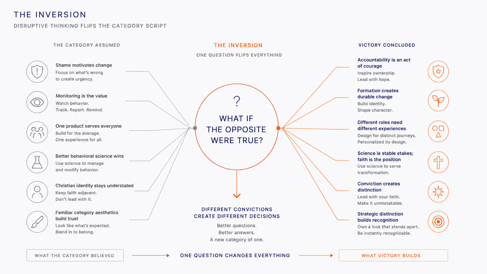
Figure 02 — Inverting the Category
Form the person; the behavior follows
The category had made one assumption without noticing it was an assumption: that behavior creates identity. Manage the behavior long enough and the person would follow. Victory concluded the reverse. Identity creates behavior. Form the person, and the behavior follows from who he now understands himself to be.
That single decision is the whole of the guiding policy. Everything else in Victory is a consequence of it.

Figure 01 — Formed, Not Watched
Tie the brand to timeless motivations
Recovery products compete around behavior. Victory chose to compete around identity. Instead of asking why a man wanted to stop using pornography, we asked what he hoped freedom would finally make possible.
That question redirected the strategy. Behind every decision to adopt, keep or abandon a product sit deeper human motivations: belonging, security, validation, purpose, autonomy, and the pull toward self-actualization. A product becomes meaningful when it attaches itself to one of those motivations rather than solving a functional problem alone.
So Victory stopped designing around pornography and began designing around the person someone hoped to become. The product stopped being the story. Human flourishing became the story, and competing on that ground meant standing where the rest of the category was not.
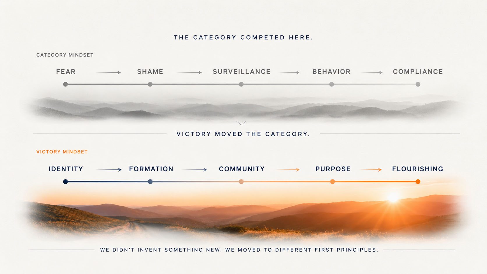
Figure 02 — Competing Higher on the Human Pyramid
The logic beneath that shift is set out most clearly in Tom Walker's Primal Desires Framework. Rather than summarize it, I have included it here as one of the strategic artifacts that shaped the thinking on this page.
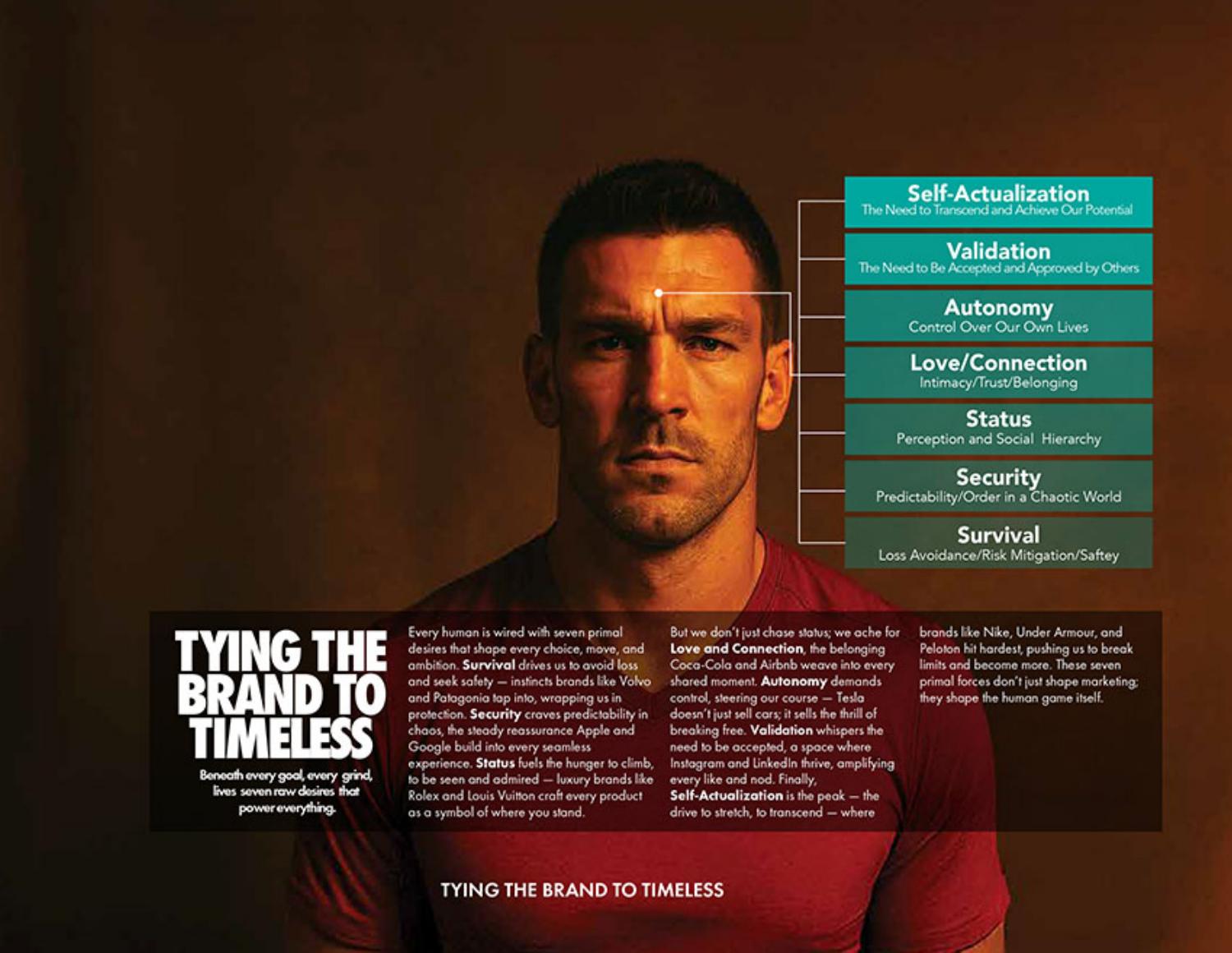
What Victory discovered
The insight was never the list of desires. It was their order. A brand grows stronger as it carries a customer toward more aspirational motivations.
Products attached only to fear, survival, shame and the avoidance of loss become exhausting relationships. They ask a person to keep returning to his worst moment. Products attached to identity, validation, belonging and purpose become enduring ones. They ask him to keep becoming.
So Victory deliberately raised the emotional center of gravity of the category. Instead of asking a man to remember, every day, what he was fighting, it invited him to imagine who he was becoming. That is the strategic inversion.
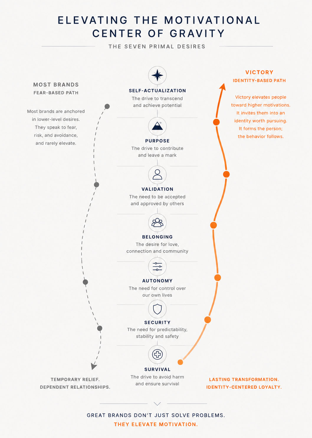
Figure 03 — Elevating the Motivational Center of Gravity
The strategic implication
Victory did not reject behavioral science. It reframed it. Behavior became the evidence of transformation instead of the engine that produced it.
Behavior is the evidence of transformation, never its engine.
The product still addressed behavior. The brand simply refused to define a person by it. That distinction changed every design decision that followed.

Figure 04 — The Brand as a Signal of Identity
Every major decision that followed traces back to this one. The product architecture. Victory Shield. The Guide. Honor. Journey. The writing voice. The visual identity. The orange. The photography. Each became another expression of a single conviction. Form the person. The behavior follows.
The architecture was a transition, not a sequence
Most accountability products ask for monitoring on the first day. Victory delayed that ask on purpose. The experience opens while a man's motivation is naturally at its highest, then moves him, over time, off his own willpower and onto something sturdier.
So Victory was never free software followed by paid software. It was one continuous journey built around a single transition, from one source of behavior change to another. The first stage runs on internal motivation. The second runs on external accountability. That handoff, not the feature set, is the architecture.
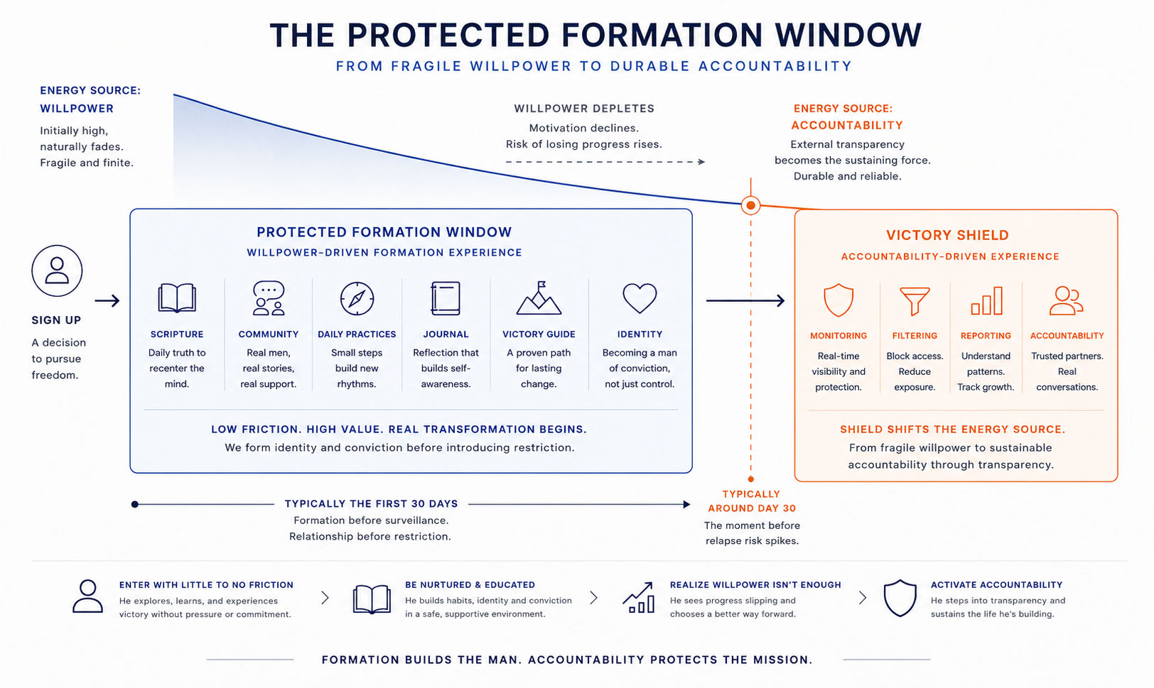
Figure 01 — The Protected Formation Window
Read left to right, the architecture stops looking like two products and starts looking like one journey across a single window. Everything below is why that window works.
The Blue Box: a protected formation window
A man enters at almost no cost and, from the first day, meets the whole of the formation experience: Scripture, formation content, daily practices, an emerging identity, community and the Victory Guide. What he does not meet is surveillance. No monitoring, no reporting, nothing watching. The window was kept clear of all of it on purpose.
Rather than asking a man to become accountable before anything else, Victory first let him feel what freedom could become. Formation before surveillance. Relationship before restriction.
The window exists because motivation follows a curve. It is highest in the days just after signup and declines from there. Victory spends that early motivation while it still exists, on building a life worth protecting later.
Formation before surveillance. Relationship before restriction.
The transition
This is the strategic move. As the early motivation fades, a man reaches a realization on his own: willpower alone will not hold. That realization, not a sales pitch, becomes the invitation to Victory Shield. By the time it arrives he already understands why accountability matters, because he has already begun building the life it exists to protect.
Victory Shield
Shield does not replace the work begun inside the window. It changes the source of the energy that sustains it. Monitoring stays only where it is needed, on the struggler's own device, so the shared formation space around him stays open and unwatched.
Internal willpower
Fragile, and highest right after signup. It can begin the change. It cannot be trusted to sustain it.
- Motivation
- Determination
- Self-discipline
- Personal resolve
- Habit momentum
External accountability
Durable, and strongest once real relationships form.
- Transparency
- Trusted relationships
- Accountability
- Encouragement
- Outside support
The whole architecture turns on that handoff. Formation begins the journey on motivation. Accountability sustains it once motivation runs low. Neither engine is asked to do the other's work.
Formation begins the journey. Accountability sustains it.
Free was never a pricing decision. It was an architectural one. The protected window gave a man room to begin changing before accountability ever entered the relationship. By the time his motivation faded, accountability, and not willpower, had become the force carrying him forward. The price only ever followed the architecture. It was never the point.
On paper the strategy now held together. But a strategy is only a decision until an organization is built to carry it, and this one asked a company to unlearn most of what its category had taught it. Which raises the next question: how did these strategic decisions become organizational work?

People remember stories, not systems
The organization was now aligned, but alignment is not yet a story. What actually held the disciplines together was something a spreadsheet could not carry. Victory could have stopped at doctrine. It could have explained formation through articles and product education. People would have understood it, and forgotten it. Human beings rarely remember systems. They remember stories.
Why stories organize people
Joseph Campbell noticed that cultures with no contact kept telling one underlying story. An ordinary person meets a challenge, receives guidance, crosses a threshold, is changed by the journey, and returns someone new. It recurs because it is not really about heroes. It is how people make sense of their own lives.
We rarely experience life as a set of isolated events. We experience it as a story we are already inside. A product becomes meaningful when it helps a person make progress in the story he already believes he is living. That is the opening Victory built on, and it fixed the brand's role from the first day: Victory chose to be the Guide who knows the road, never the Hero who walks it.
Figure 01 — The Hero's Journey as Human Structure
Victory intentionally occupied the role of Guide rather than Hero.
Recovery already carried the shape of a journey. People described it that way on their own, without prompting: I've lost my way. I've gone backwards. I'm trying to get back. The language was already there. Victory only had to listen for it, and build on what the customer was living.
Recovery already felt like a road. The metaphor invented nothing. It simply gave shape to a reality the customer was already living.
That fixes Victory's role for good. The customer is the hero, the only one who can take the next step. Victory is the Guide. The road does the work.
Figure 02 — The Guide
Reframed this way, accountability stops being surveillance and becomes guidance; recovery stops being behavior management and becomes formation. The technology never changed. The story it served did. A man can feel which story he is inside within the first minute, and he has spent years inside the other one. The story is not packaging on the product. It is the difference between a guide and a warden.
Every great brand tells a story
Victory is not unusual in this. The strongest brands in every category organize themselves around a governing story, a metaphor the customer steps into. People rarely notice it consciously. They feel it, and it quietly decides how the brand behaves.
A few familiar examples, before the next chapter follows the story into the work itself:
| Brand | Underlying metaphor | Who the customer becomes |
|---|---|---|
| Nike | The athlete's journey | Someone overcoming himself |
| Apple | Creative empowerment | A maker whose ideas can matter |
| Harley-Davidson | Freedom on the open road | An independent outsider |
| Disney | Wonder | The hero inside a story |
| Patagonia | Stewardship | A protector rather than a consumer |
| Jeep | The trail beyond the map | An explorer who leaves the pavement |
| REI | Life happens outside | An explorer, not a spectator |
| YETI | The earned wild | Someone who takes the outdoors seriously |
| LEGO | A world you can build | A creator of his own worlds |
| Starbucks | The third place | A regular with somewhere to belong |
The same principle shaped Victory. And once everyone in a company works from the same story, something quiet follows: every creative decision starts drawing from the same source. A shared story gives rise, on its own, to a richer language, to symbols, environments and experiences that already belong together.
Figure 03 — Continuing the Journey
A shared story changes how people think. A shared metaphor changes what they build.
What the story changes
The previous chapter established that everyone now shares the same story. This chapter is about what that produces. Once a metaphor governs the decisions, the product stops being a collection of generic software features and begins to speak the language of the world it inhabits.
A generic product offers check-ins; a journey offers waypoints. A dashboard becomes a map. A button stops being a control and becomes an invitation to keep going. Progress is no longer a percentage, it is movement. Encouragement is no longer a notification, it is companionship. Once the interface speaks the language of the road, the product stops feeling assembled and starts feeling inevitable.
The product stops feeling assembled. It starts feeling inevitable.
This is why a metaphor is design material and not decoration. A governing story supplies the vocabulary for the entire system: features and the names they carry, onboarding, notifications, illustration and iconography, interaction patterns, photography, writing, the words a community uses, its rituals, and the visual identity itself. Each medium stops inventing on its own and begins to tell the same story.
It is also where real distinction comes from. Brands do not become singular by choosing unusual colors. They become singular because every expression grows from the same underlying world, so nothing feels borrowed and nothing contradicts. The brands a person can recognize in a heartbeat all pass this test.
The customer becomes a protector rather than a consumer. Repair, reuse and activism make buying less the point than belonging to a cause, which is why the brand can tell you not to buy and grow stronger for it.
The customer becomes an explorer, not a spectator. The co-op frames the outdoors as a shared practice, so membership, classes and even closing the store on a holiday all say the same thing.
The customer becomes someone who takes the outdoors seriously. Overbuilt gear signals competence, so the cooler becomes a badge of the kind of trips a person takes.
The customer becomes an explorer who leaves the pavement. Capability and heritage promise access to the wild, so even an unused vehicle sells the freedom to go.
The customer becomes someone overcoming himself. Effort is framed as heroic, so the product is never the point; the mark certifies a victory the customer is assumed to be chasing.
The customer becomes an independent outsider. Sound, ritual and the club turn a machine into a declaration, so ownership is membership in a way of being rather than a purchase.
The customer becomes a maker whose ideas can matter. Everything is simplified until the tool disappears and the idea leads, because a creator should feel capable, not configured.
The customer becomes a creator of his own worlds. Open systems reward imagination over instruction, so the product is a grammar rather than a toy.
The customer becomes the hero inside a story. Every touchpoint is staged so the guest is cast rather than served, and the park behaves like a plot.
The customer becomes a regular with somewhere to belong. Ritual, warmth and a name on the cup turn a transaction into a room of one's own between work and home.
When the metaphor is chosen well, the customer never consciously notices it. He notices only that everything fits, that the thing is easy to understand because every part is speaking the same language. That felt coherence is what people are pointing at when they call something a great brand.
Victory chose its metaphor the same way. It did not invent the road; its customers already described recovery as one. What Victory added was the decision to build the entire system on it, until the metaphor stopped being a theme and became a design system.
The Reforging Road
A road is one of humanity's oldest metaphors. It has direction. It demands movement. It punishes a wrong step and it does not care how tired you are. Victory did not reach for it because it was poetic. It reached for it because the men it serves were already on it, thirsty and losing ground, long before anyone gave it a name.
Reforging supplies what movement alone cannot: transformation. Metal enters a forge as one thing and leaves as another, through repeated cycles of heat, pressure and cooling, never through a single event. Character forms the same way. So difficulty is not evidence of abandonment. It is evidence of becoming.
promises completion. It is measured by compliance, and it asks people to finish.
promises formation. It is measured by direction, and it asks people to continue.
The road does not encourage. It forms.
Because the metaphor is load-bearing, nothing in the identity exists apart from it. Type leans because the road is long. Photography carries grit because the road is real. Color points because the road has a direction. Voice names the next mile. Each discipline is the same road in a different medium.
If a decision cannot be traced back to the road, it does not belong in the system. That one constraint is what keeps the work coherent across every hand and surface. It also keeps the brand honest, because a road is the one metaphor that cannot promise an easy arrival without contradicting itself.
Victory is the Guide
Every great story gives everyone a job, and the fastest way to break one is to let the roles blur. Products try to become saviors. Spouses become probation officers. Customers expect software to perform transformation. Victory keeps the roles separate. Clear roles are what let each one help without getting in another's way.
The Guide's greatest success is becoming almost invisible.
So Victory behaves with restraint. It provides orientation, structure and encouragement, and it leaves the climb in place, because removing the climb would prevent the formation. Its authority comes from understanding the road. It has no need to inflate its own part.
The moment the brand becomes the hero, the rescuer, the cure, the reason for success, the customer turns into a spectator in his own recovery. The Guide keeps him in the lead role, because that is the only role in which a person changes.
The Guide equips. The Pilgrim walks. The Companion remains. Victory guides the Pilgrim and the Companion alike, and neither fully understands the road without it. The Pilgrim chooses the next step. The Companion shares the burden of taking it. Transformation rarely happens alone.
Victory never removes the road. It proves it knows the road. Every decision in this system is measured against one belief in the customer's mind, that these people understand where he is and how to help him take the next step. Lose that belief and nothing else matters.
The Pilgrim
Victory was never designed for "pornography users." That category is too clinical to build anything human on. It was designed for one person, the Pilgrim. A man worn out by the distance between the life he professes and the life he privately lives. He is not looking for relief. He is looking for restoration.
The word was chosen with care. A pilgrim walks toward something sacred, and the walk itself changes him. One motive runs from fear and the other toward hope. Hope sustains the longer journey.
He is pursuing wholeness. Quitting pornography is the first mile of it, never the destination.
And he lives between two stories. Every interaction strengthens one and weakens the other; there is no neutral.
says he is what he has done. Disqualified, and safer hiding than hoping.
says failure can become formation, God has not withdrawn his presence and humility is the beginning of wisdom.
Early on the Pilgrim walks alone, and that solitude is on purpose. The first steps have to be his own. Then he reaches the place where determination runs out, and a quieter decision waits there. He can leave the road, or he can ask another man to walk it with him. A Companion cannot take a step for him. What he can do is refuse to let him walk it alone.
Underneath "make it stop" is a larger request. To become someone he can trust again, whose private life matches his public one. The goal is wholeness. The absence of pornography is one sign of it.
Designing from the road
Everything so far was building one thing. A story the customer was already living, a metaphor that gave it language, a Guide who knows the road, a Pilgrim who walks it. Held together, they become something an organization can design from.
Inside the company the road became a shared mental model. A story every discipline understood the same way gave everyone one place to decide from, so the work stopped being a set of separate outputs and became one journey told in different mediums.
The questions change. A team stops asking what feature to build, what email to send, what campaign to launch. It starts asking where this person is on the road, what he is experiencing there, and what would help him take the next step.
The question stops being what to build. It becomes where this person is on the road, and what helps him take the next step.
That shift moves through the whole organization. Product, marketing, design and customer support stop optimizing their own outputs and become expressions of one shared story. Marketing meets the traveler where he actually is. Product weighs the next step from where he stands. Design serves his progress. Support opens with empathy rather than compliance, because the person on the other end is somewhere on a road, not out of policy.
Autonomy that still fits
This is what a shared story is actually for. It is not a rulebook that has to be enforced. It is a common map that lets people move on their own. A writer, a designer and a support agent can each make a hundred decisions no one reviews, and the decisions still cohere, because all three are answering the same question from the same place on the road.
That is the rare pairing most systems cannot offer, real autonomy and real fit at once. Rules buy fit by removing autonomy. A shared story buys both, because it aligns judgment instead of dictating output. The designer stays free to solve the problem in front of her; the story only asks that her solution belong to the same road as everyone else's.
A person does not need permission for every decision. He needs to know the story well enough to decide from it. Give the disciplines the road, and they bring back work that fits without being told how, which is the only kind of coherence that survives scale.
How the four work together
Four ideas, one engine. Each answers a different question, and the identity system is where all four become visible. Read top to bottom, they make a single sentence.
A story, told in a language, with a guide and a traveler, expressed as a system. Identity grows from the narrative, which is why nothing in the Identity System is allowed to exist on its own. By the time it is drawn, the whole company is already telling the story, so the identity never feels arbitrary. It feels inevitable.
The road performs the formation. The traveler chooses to continue walking.
Everything to this point has been story, role and alignment. What is left is to make the story visible and audible. What follows is not a collection of assets but one integrated communication system: logo, typography, color, photography, iconography and language each solve a different problem, and every one of them carries the same road. So the next chapter answers the practical question: how did this story become a visual and verbal identity?
Teaching the organization how to think about brands before asking it to choose one
Strategy becomes real only when an organization can carry it, and that capacity is built long before any decision is final. Although the Victory strategy would not be settled until February 2025, the work began nearly four years earlier.
In November 2021, the company’s leadership team gathered at headquarters for the first cross-functional discussion about what Victory could become. Before anyone could debate names, positioning or identity, the organization needed a shared language for understanding brand architecture itself.
I was asked to develop and lead an educational workshop explaining the major architecture models, the tradeoffs each created, and how those choices would shape the future relationship between Covenant Eyes and Victory.
Rather than creating a presentation that disappeared after the meeting, I designed the workshop as a printed reference book. Brand-architecture decisions have consequences that often surface months or years later, and I wanted the leadership team to leave with a common language they could keep using long after the onsite concluded.
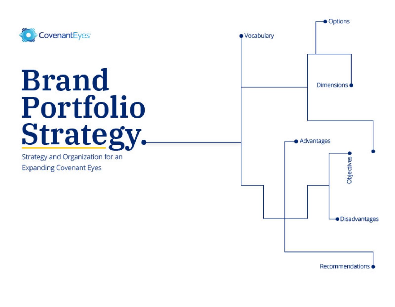
The discussion helped the team evaluate the implications of each model and ultimately aligned the organization around a Strong Endorser strategy. At launch, Victory would leverage the trust and credibility of Covenant Eyes while establishing the foundation necessary to earn independent equity over time.
The book outlived the onsite by years. As late as June 2025, the CEO still reached for it when new brand-architecture questions surfaced, which is exactly what a leave-behind artifact is for. It had become part of the organization’s memory. The lasting outcome was not the model the team chose. It was that the organization had learned how to ask better questions, and that was the precondition for the harder conversation still ahead.
How do you move an organization beyond four years of competing convictions?
A shared language was the precondition, not the answer. Now that the organization could talk about brands with the same vocabulary, it could finally confront the argument it had been having with itself for years. The company had spent nearly four years trying to name its position in the category and never quite agreed. The ideas in the room were not weak. Several were genuinely good. What the company lacked was not insight but alignment, and no amount of further discussion was going to produce it.
So I proposed a different setting. Rather than let the question drift through more meetings, I brought the essential decision-makers into a single room for a single day with one instruction: no one leaves without a shared strategic direction. The onsite ran eight hours at company headquarters. The room was deliberately small. The CEO, the VP of Marketing, the VP of Product, a Product Strategist, the Digital Marketing Manager and I, leading the creative work, were the only people present. Every decision-maker who mattered was there, and no one who did not need to be.
This was more than an executive presentation. It was a working strategic artifact designed to survive the meeting itself. It gave leadership a shared way of seeing the category and the customer, captured in a book they could return to, so the understanding built in one room kept shaping decisions long after the workshop ended.
The day opened with strategy, not branding. I framed the conversation with the Two Battles, the model that separates the fight for the category from the fight for the product, because leadership first needed a shared way to tell opportunity apart from execution. Only then did we work through positioning and differentiation as a group. The aim was never compromise, which tends to average strong ideas into weak ones. The aim was clarity. I made room for nuance and refused to make room for a softened position.
By the end of the day the argument had resolved into two decisions, and everything that followed depended on them.
Those two sentences dissolved four years of uncertainty. They also did something branding alone never could. They gave the identity work permission to begin. Branding did not create the strategy. The strategy created the conditions that made branding possible, and this is the day Victory became inevitable. For the first time in four years, the organization knew who it was.
How do you turn strategic direction into a creative team capable of carrying it forward?
Executive alignment answered what Victory would stand for. It did not yet answer who would carry that direction into the work. Direction lived at the top of the organization. Understanding had to reach the people who would actually build the product.
So a cross-functional branding team was assembled from across the country and brought together for a two-and-a-half-day onsite. The purpose was not to brainstorm a logo. It was to become a team. The opening sessions built a common language before any creative work began: brand strategy, identity systems, story, customer roles and the creative principles the group would share. Several people arrived with strong convictions of their own. Those were welcomed, and then held loosely, in service of something larger than any single opinion.
The onsite presentation became the team’s field manual for the months that followed. Rather than asking everyone to remember a two-day workshop, I designed a reference artifact they could revisit as the branding work unfolded across the summer. It held the shared vocabulary, reinforced the strategic principles, and helped a distributed cross-functional team keep making consistent decisions long after they returned home.
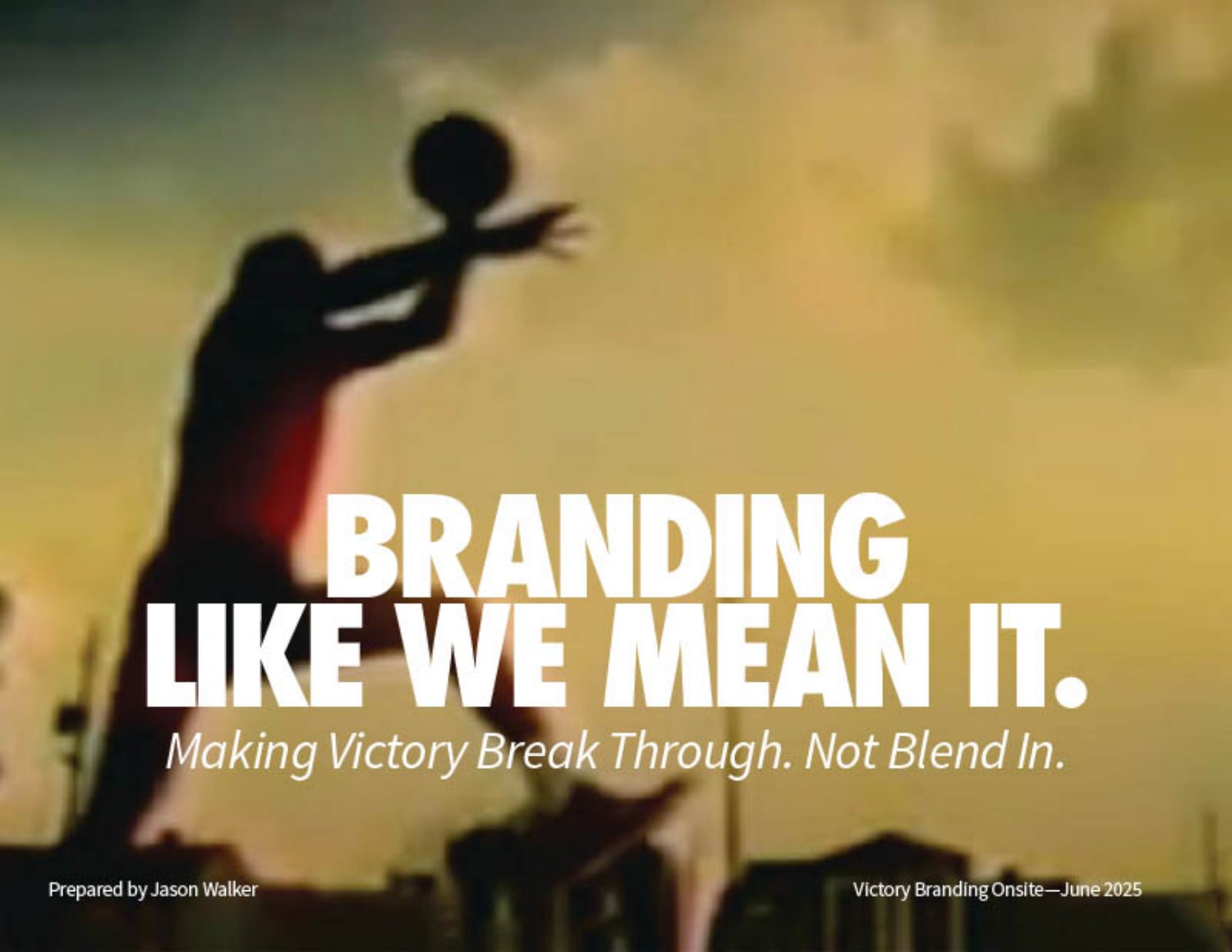
Over the days the group moved through strategic presentations and collaborative workshops, explored metaphors, worked through customer-story exercises, and spent as much time building relationships as building ideas. Before anyone flew home, the summer timeline, the expectations and the way decisions would be made were all made explicit.
The workshops were the turning point. Instead of asking people to decorate a brand, we invited them to shape a story, and a shared story gives every discipline its own reason to contribute. Design, product, marketing and engineering all left pointed at the same destination.
“I had no idea how much branding could shape my product design work. Having the story really opened up ways for me to be creative with the design of these features.” Tim · Product Designer
These few days established more than a process. They established a shared way of thinking. The team went home with a common language, a shared strategic direction, real trust in one another, a disciplined process, dedicated time and open permission to explore. The identity that followed was never the product of one person’s talent. It was the work of a team that had first learned to see the same story.
A system built in the order it was discovered
An identity is not only designed. It is discovered, and someone has to lead the discovery. The three onsites were the visible moments of that work: teaching the organization a language, aligning its executives, and building a team that could carry the strategy forward. What connected them was never a schedule. It was a way of leading, and this page is a reflection on that rather than a retelling.
Seen at a distance, the whole arc fits on a single timeline, from that first workshop through the identity’s discovery and adoption to the long stretch of living inside the system.
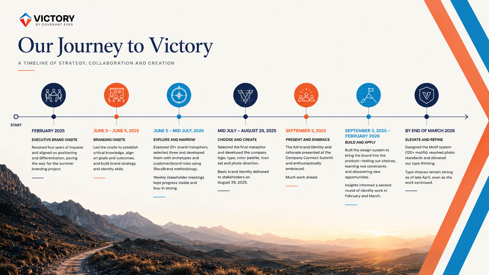
Figure 01 — System Discovery Timeline
The first discipline was patience. The organization had carried its strategic disagreement for nearly four years, and the temptation was always to rush past it into visible work. Instead the sequence was held in order: a shared language before strategy, resolved strategy before a team, and a capable team before the identity ever entered a product. Each phase was slow because each one earned the next. Nothing was decided before the organization was ready to decide it.
The second discipline was stewardship. Leadership here rarely looked like authorship. It looked like designing the conditions in which other people could think clearly and choose well: framing the right question, building the artifact that kept teaching after the room emptied, and trusting each discipline to carry the story in its own work. When the identity finally met engineering and accessibility inside real products, those encounters produced coherence rather than compromise, because the system had been built to keep learning. Victory matured the way organizations do, in the order it was discovered.
Victory was never built through isolated creative decisions. The logo, the typography, the color system, the motifs, the photography, the language and the interactions were never developed as independent expressions of taste. Each was measured against the same question: does this reinforce the meaning system we are building? Design here was never decorative. It was surgical. Every choice either strengthened the central idea or it was cut, and that discipline is why the identity grew more coherent as it matured rather than more scattered.
All of it was written down. The identity was never left to memory or to whoever happened to be designing at the time. It was documented as a complete system, from strategy and verbal identity through color, typography, iconography, photography, product architecture and design grammar, with the guidance for putting each into practice. The intent was governance as much as design: one reference the organization could return to so the brand kept sounding and looking like itself long after the initial work was finished.

Leadership and alignment made the work possible. They did not, by themselves, make it coherent. An aligned organization can still ship a hundred disconnected outputs, each defensible on its own. What kept every discipline pulling in one direction was not a process or a workflow. It was a story all of them had learned to tell. Which is the question the next chapter takes up: what story ultimately unified all of this work?
A symbol of guided transformation
The Journey mark was never drawn to depict an object. It was drawn to hold a set of relationships. Before a single word is read it fixes three participants in relation to one another — an organization that guides, a person who moves, and a product that supports — and then asks the eye to complete the picture. What looks at first like one compass form is really a small argument about who is responsible for what on the road to recovery.

Color is not applied to the mark; it is part of it. Blue belongs to Covenant Eyes, the organization that guides, and sits above; orange belongs to Victory, the road the customer actually walks, and carries the form below. The two are inseparable — the same descent and ascent that give the mark its shape also move it from the institution that orients to the product that accompanies. Along that vertical the tone lifts subtly from darker toward lighter, a quiet reading of growing clarity, of things a little brighter on the far side of Victory. Form and color are one identity, stated together before a word is read.
Three relationships around one figure
The mark is built from three visible forms arranged around a fourth that is never drawn. Each visible element stands for one participant in the Victory ecosystem; the empty center stands for the customer. Read together, they describe guidance, agency and support in a single glance.
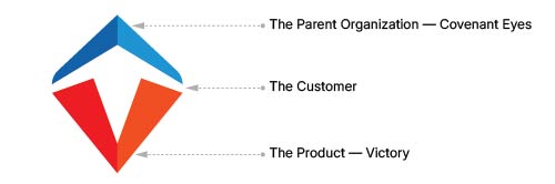
Figure 01 — Symbolic Breakdown
The Parent Organization
The blue upper element represents Covenant Eyes, the parent organization. It carries stewardship, oversight, guidance, authority, protection and orientation — the things an institution is meant to hold so the person beneath it does not have to. It sits above the composition like an umbrella of guidance, establishing direction before any movement begins. Its outer corners are softened rather than squared, so the form reads as refinement and forward motion rather than rigid control.
The Customer
The customer is present only as negative space. The white between the forms reads at once as an upward arrow, a standing human figure and a path. Victory leaves the customer deliberately undefined: no face, no posture, no type. He is not illustrated, because he is not finished. He completes the symbol the only way the doctrine allows — through movement rather than depiction.

Figure 02 — Negative Space
The Product
The orange lower form represents Victory itself. It is foundation, support, structure and destination at once: it surrounds and holds the customer while simultaneously forming the Victory V. Its geometry can be read as a small journey in three moves — a descent into the vertex, a decision held at the point, and an ascent back into the open. The customer enters fragmented; the path narrows into commitment; the way opens again with more clarity than before.
Authority above, support below, and between them a person assembled out of the space they leave for him. The mark states the brand's whole posture before the wordmark is even noticed.
An architecture of three
The mark settles naturally into relationships of three. This is offered as an observation, not a hidden code: the triad is already so deep in the Victory system that the symbol could hardly avoid echoing it. The point is coherence, not secret meaning.
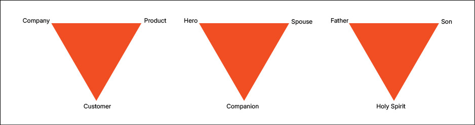
Figure 03 — Trinity Relationships
The discipline beneath the symbol
The mark feels stable because several proportional systems agree at once. The diagram does the teaching; the copy only names what it rewards.
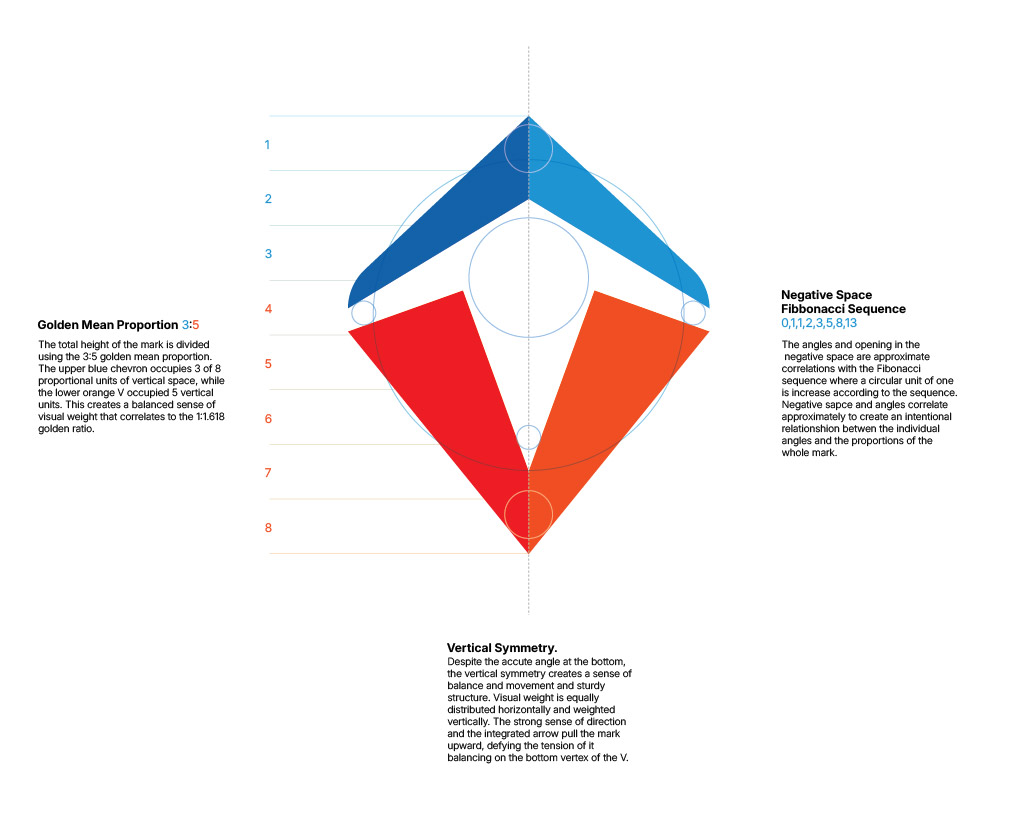
Figure 04 — Proportional Framework
Read the height as eight equal units: the blue chevron takes about three, the orange V about five — a 3:5 relationship that loosely echoes the Golden Mean. The construction hangs from two points, the apex of the blue chevron and the vertex of the orange V, while equalized horizontal intervals set the spacing and rhythm the rest of the system inherits.
Even the negative space is governed, answering to the same proportions; the way its openings expand can be read through Fibonacci-like relationships that emerge from the design rather than dictate it — a lens for reading the finished geometry, not the method that made it. Nothing here is arbitrary, and nothing decorative. The mark is disciplined, and it reads that way at a glance.
The production family
Everything above governs everything that follows. The production system is simply the mark made usable — the same symbol expressed across the lockups, color versions and applications a working brand requires, with no decision left to chance at the point of use.
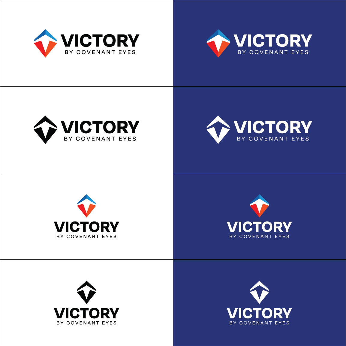
Figure 05 — Identity Family
Heraldry, not a second logo
The Victory Shield is often mistaken for a separate brand. It is not. It is heraldry: an affordance that lets a person tell, at a glance, which kind of experience he is in within the ecosystem. The logo stays constant; the shield signals application type. One says who this is. The other says what this does.
Everything above establishes the principles that govern the Shield mark. What follows demonstrates those principles expressed as a complete identity family. Every approved variation shares the same geometry, symbolism and visual language, allowing the identity to adapt while remaining unmistakably Shield.
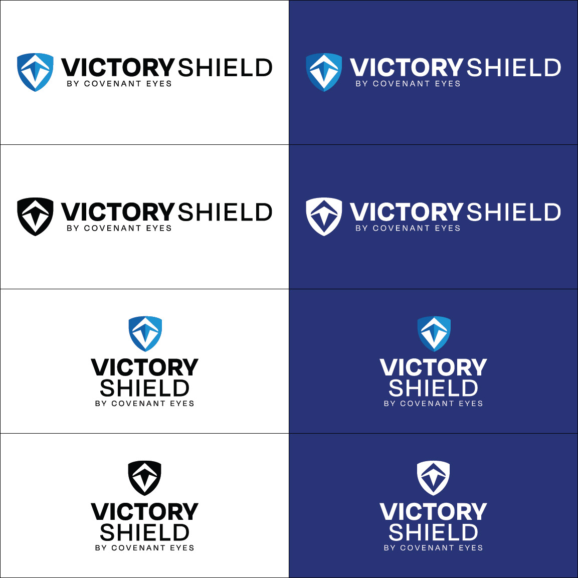
Figure 06 — Shield Identity Family
One narrative, read in a glance
Read quickly, the mark simply points and waits. Nothing in it watches the man, and nothing finishes him; it offers direction and leaves the moving to him.
The mark does not depict transformation. It leaves room for it, and trusts the man to supply the motion.
Finding a human voice within technical constraints
Typography here was never an exercise in aesthetic preference. It was a systems design problem. The faces had to survive dynamically generated reports, self-hosted deployment, accessibility review and a decade of product economics, and still sound like a person, not a platform. What follows is less a font list than an account of how a voice was found inside boundaries that were set before the search began.
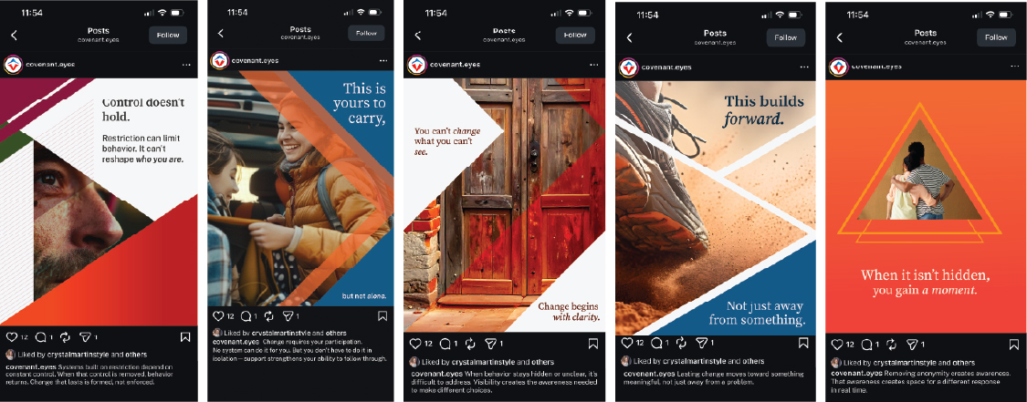
Figure 01 — Typography in Context
The problem before the preference
Type sat at the intersection of several independent forces, each pressing on the decision at once. Together they decided most of it before a single specimen was compared. That is disciplined choice, not open exploration.
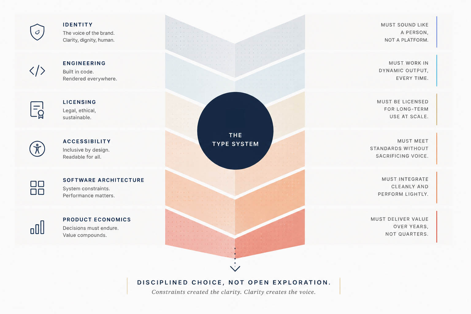
Figure 02 — Design Constraints
Constraint 01 · Commercial licensing
Victory renders type inside dynamically generated reports and live application surfaces, not just marketing pages. Conventional commercial font licensing is metered, seat-counted and redistribution-restricted. That turned an ordinary rendering task into operational and legal complexity, and recurring cost. The team chose to design within open-source licensing from the start, so the type could be used freely wherever the product needed it.
Constraint 02 · Engineering
The fonts had to be fully self-hosted. External delivery services such as Adobe Typekit were ruled out on deployment and security grounds: a recovery product cannot make its core typography depend on a third-party request that might fail, lag or leak. The type had to live entirely inside the application's own infrastructure.
Constraint 03 · A defined ecosystem
Together those constraints narrowed the field. Rather than search the whole typographic landscape, the work optimized inside a carefully bounded one, openly licensed, self-hostable and proven. Typography became the task of finding the strongest voice available within real operational limits, which is the form most design leadership actually takes.
The voice of wisdom
Typography is never neutral. Every typeface makes an assumption about the relationship between writer and reader. The software industry has largely taught itself to speak with the voice of the system, and the sans serif became the natural expression of that posture: clarity, efficiency, utility, technology. Those qualities are valuable, and Victory needed all of them. It simply refused to let the system be the first voice the reader met. The guide should introduce the journey before the software does, so the type opens with a human voice.
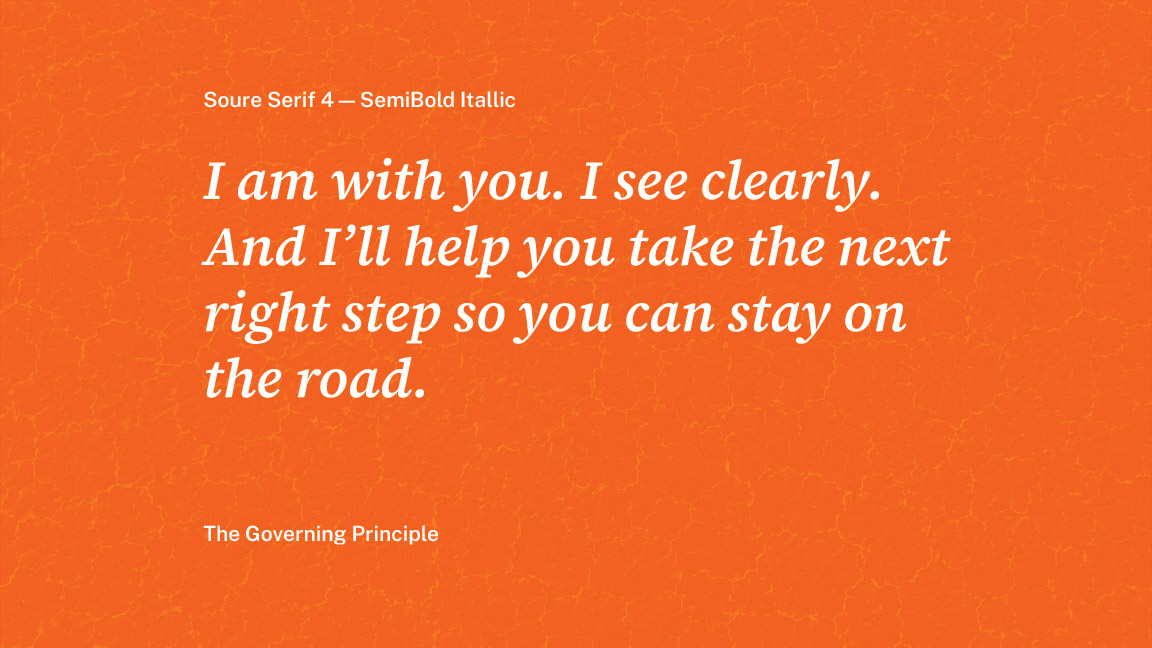
Figure 03 — Source Serif 4
The decision was never that we prefer serifs. It began as a question: what voice best serves someone arriving at this product? The answer had to do two things at once. It needed enough intellectual credibility that a reader instinctively trusts what he is about to read, and enough warmth that the writing never feels like it is lecturing, diagnosing or chastising him. Those two requirements together rule out most typefaces. Source Serif 4 quietly occupies the narrow ground between them. It was chosen because it solved that communication problem, not because it was beautiful.
It is inspired by the thinking of Pierre-Simon Fournier rather than his drawings, a contemporary interpretation and not a revival. Fournier held that type should serve reading before style, and that conviction survives in the letterforms. Like Victory, it honors tradition only where tradition still serves people. Moderate stroke contrast gives the page rhythm without becoming theatrical. Gently bracketed serifs soften the transitions between strokes. Generous counters let more light into dense paragraphs, a comfortable x-height sustains extended reading, and open forms reduce friction instead of asking to be noticed. Every one of those choices answers a single question: does it help a pilgrim keep reading?
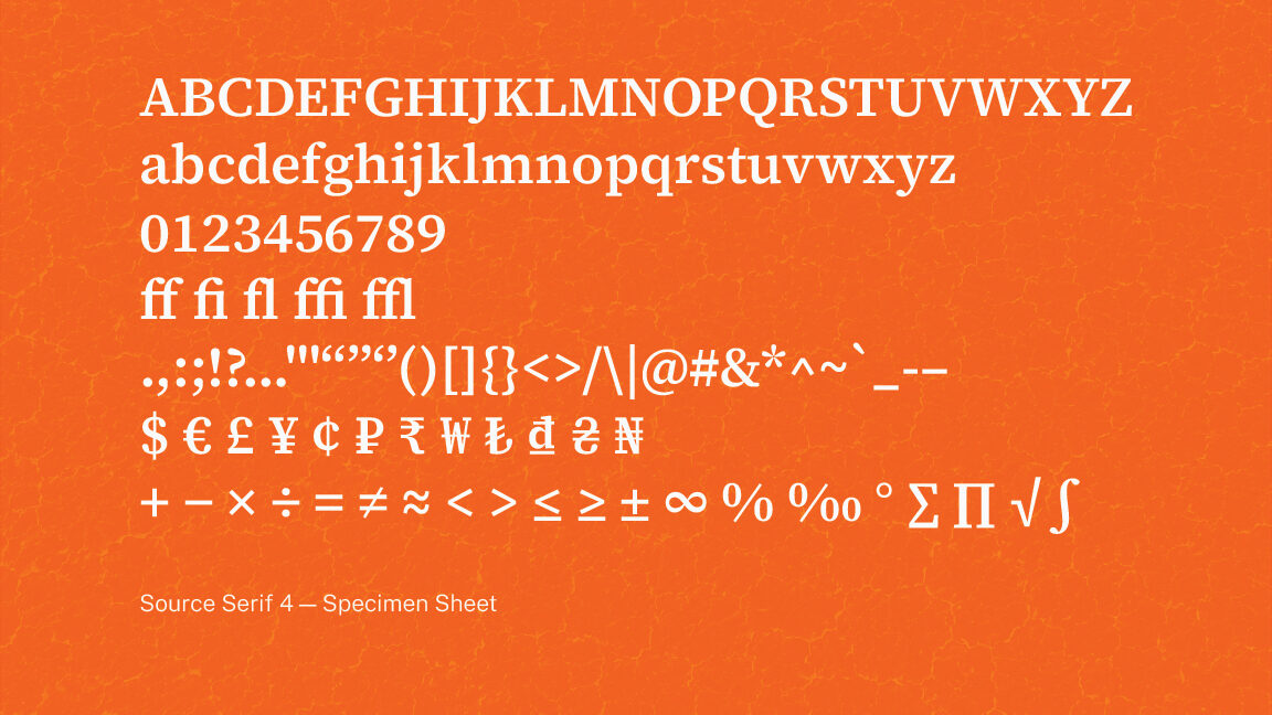
Figure 04 — Source Serif 4 Character Specimen
That question matters because Victory is written for pilgrims, not spectators. People often arrive carrying shame, or fear, or exhaustion. Typography is not decoration then. It is hospitality. Each decision quietly lowers the cost of continuing, so the type never feels like one more authority speaking down to the reader. It feels like someone walking beside him. Public Sans gives Victory its structure and Source Serif 4 gives it its voice. One organizes, the other accompanies. Neither is complete without the other.
The voice of clarity
Public Sans came from the U.S. Web Design System, where type exists to make public information trustworthy, accessible and immediately understandable. That is not a neutral brief but a demanding one, and it aligned closely with what Victory needed. Victory asks people to make hard decisions while carrying real emotional weight, and the interface must never become one more obstacle. Every heading, every label, every navigation element and every data point has to explain itself at once, so the reader spends attention on the content rather than on decoding the screen. Public Sans quietly removes that burden.
It was not chosen because it lacked personality. It was chosen because it knows when personality should step aside, letting the writing, the imagery and the product experience carry the voice. Clarity is not the absence of design. It is the disciplined removal of unnecessary effort, and that is what Public Sans contributes.
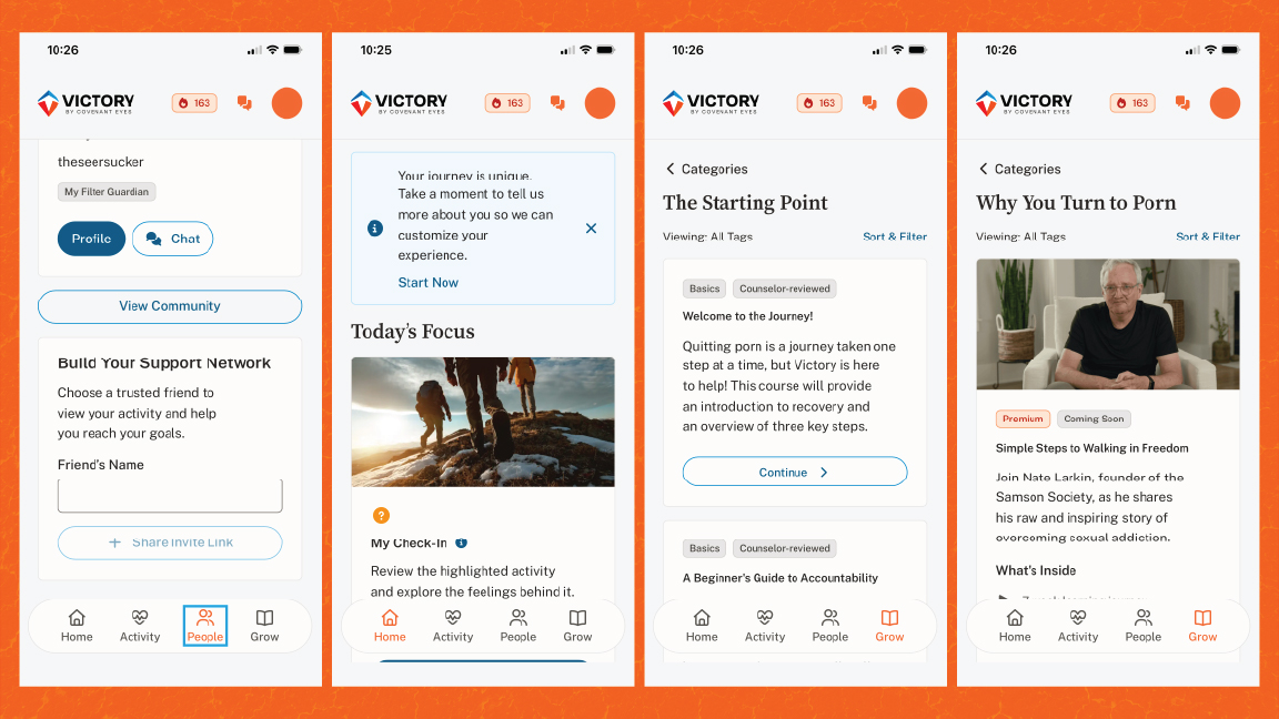
Figure 05 — Public Sans
Its qualities all point at the reader. A generous x-height and open counters, restrained stroke contrast, straightforward construction and balanced spacing add up to forms that are simply easy to take in. They reduce cognitive effort, support rapid recognition, hold their legibility across every interface, and build confidence without asking to be noticed. The point is never the letters. It is that the reader understands before he has to work for it.
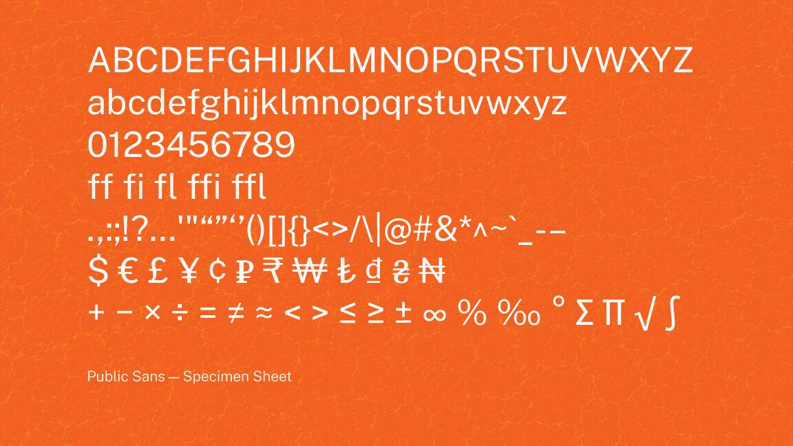
Figure 06 — Public Sans Character Specimen
Public Sans is not the opposite of Source Serif 4. The two share a philosophy, each designed to disappear into communication and to put readability before expression. Public Sans organizes the conversation; Source Serif 4 carries it. The next section takes up how that pairing holds.
One conversation. Two voices.
Typography is not assembled from favorite typefaces. It is composed from voices that know when to speak and when to remain quiet. Public Sans and Source Serif 4 were never paired because they contrast. They were paired because they agree.
Both were designed with the same ambition: to help people understand information before they notice typography. Neither seeks attention, and neither depends on stylistic novelty. Each removes friction in its own way, letting the reader focus on the ideas rather than the design. That shared philosophy made them unusually compatible.
Public Sans contributes order; Source Serif 4 contributes presence. One gives the system architectural clarity, the other a human voice, and neither attempts to perform the other's work. Their contrast is functional before it is visual, which is why the pairing holds. It follows one of typography's oldest principles: pairings are built on complementary roles, not competing personalities.

Figure 07 — Two Voices, One System
The parallel runs deeper than typography. Just as Journey and the Victory Shield carry different responsibilities inside one ecosystem, Source Serif 4 and Public Sans carry different responsibilities inside one voice. Different work, shared intent. Source Serif 4 opens the conversation and earns trust without demanding authority; Public Sans organizes everything around it. Together they let the experience feel structured without becoming clinical, and reflective without becoming sentimental.
Neither was selected to be fashionable or to make the identity feel distinctive. Each solved a different communication problem, and together they solved the larger one: a system credible enough to earn intuitive trust, yet approachable enough that it never sounds like it is lecturing the reader.
The pairing is not built on contrast. It is built on shared intent. Both typefaces were designed to serve the reader before themselves, which is Victory's own philosophy: remove the friction so the reader can keep moving forward. Neither is complete without the other.
Typography here was never chosen to express taste. It was chosen to express trust. Public Sans and Source Serif 4 solve different communication problems while serving the same reader, and together they place understanding before expression and people before software. That is the whole of the type system, and it is enough.
Color speaks before a word is read
Color is the first thing a person registers and among the last things they consciously notice. It reaches the eye before a headline is read, sets a mood before the typography has been parsed, and creates an expectation before the product has been understood. By the time language arrives, color has already made its argument.
That makes color a strategic instrument, not a finishing touch. For Victory the question was never which colors looked good together. It was what the palette needed to say, to whom, and in what emotional state they would encounter it. Before a single swatch was chosen, color had a job to do, and that job began with the category Victory was trying to leave.
The category had quietly agreed on a color
Look across accountability software and the palettes blur together. Cool blues, blue-greens and blue-violets, with the occasional gray. Over years the category had converged on nearly identical schemes. Blue had become shorthand for trust. Cool had become shorthand for safety. These were once real choices, but they had hardened into expectations, and the category had largely stopped asking whether they still worked.
When every product in a market looks the same, color stops differentiating and starts commoditizing. Visual sameness quietly signals that the products behind it are interchangeable too. Victory broke the convention on purpose, not for novelty, but because that sameness was itself a strategic problem worth solving.
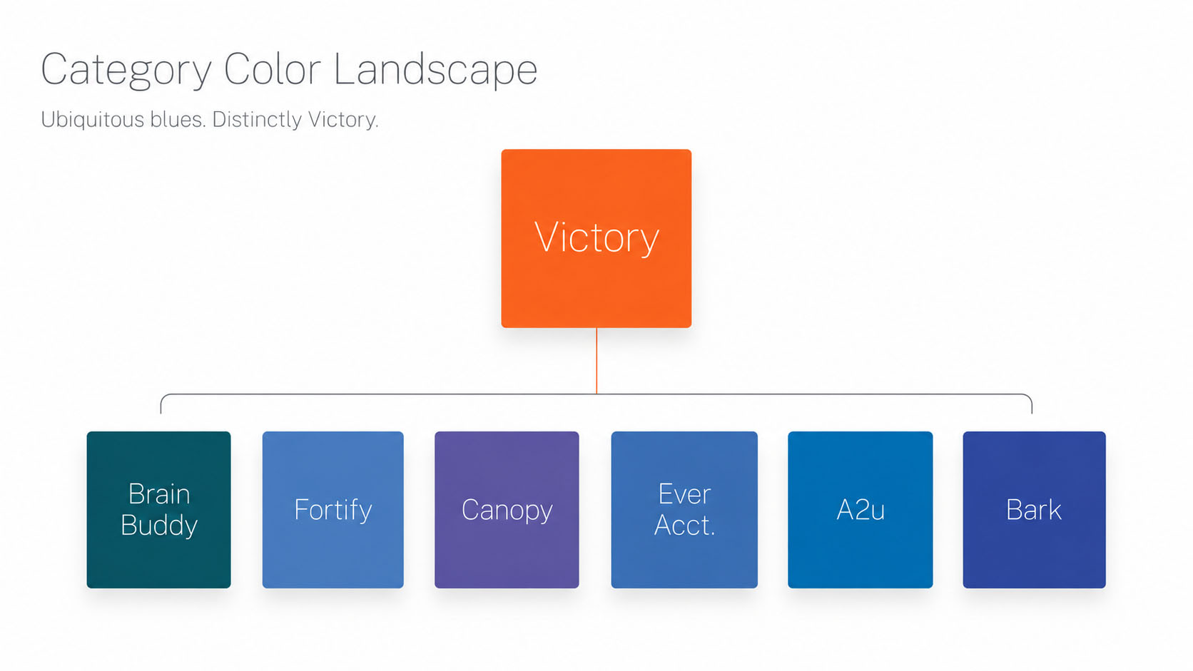
Figure 01 — Category Color Landscape
The color of becoming
Orange was not chosen because it feels energetic. It was chosen because it means transition. Orange sits between two of the most heavily symbolic colors we have. Red carries warning, danger, pressure and the memory of failure. Yellow carries optimism, hope, joy and the feeling of arrival. Orange is the passage between them.
Victory is not a story about either endpoint. It is not crisis, and it is not a finish line. It is the road between the two, the slow work of moving from one condition toward another. Orange is the color of that movement, of becoming rather than being, and it reinforces the Reforging Road that runs through the whole identity.
Figure 02 — Red, Orange, Yellow
Orange occupies the symbolic space between warning and arrival, making transition itself the central idea. Rather than representing an emotional endpoint, it becomes the visual language of movement, growth and becoming.
It does strategic work as well. Its warmth pushes directly against the cool posture of the category, so the product signals a different approach at a glance. This is neither crisis branding nor generic wellness. It is movement, growth and transformation, stated in a single hue before a word is read.
Correlating color with communication intent
Most conversations about color stop with symbolism, asking what a single hue communicates on its own. The framework beneath Victory’s palette began with a different question. How do relationships between colors shape the way communication is experienced?
During graduate school I developed a continuum that organizes color relationships from unity to variety and correlates those positions with communication intent. As color relationships become more varied, visual energy and cognitive activity increase. As they become more unified, communication becomes quieter, calmer and easier to process.
Rather than selecting colors because they looked good together, this framework made it possible to choose color relationships that reinforced the purpose of the message itself. Color became another layer of information architecture, shaping not only what people saw, but how they experienced the content they were reading.
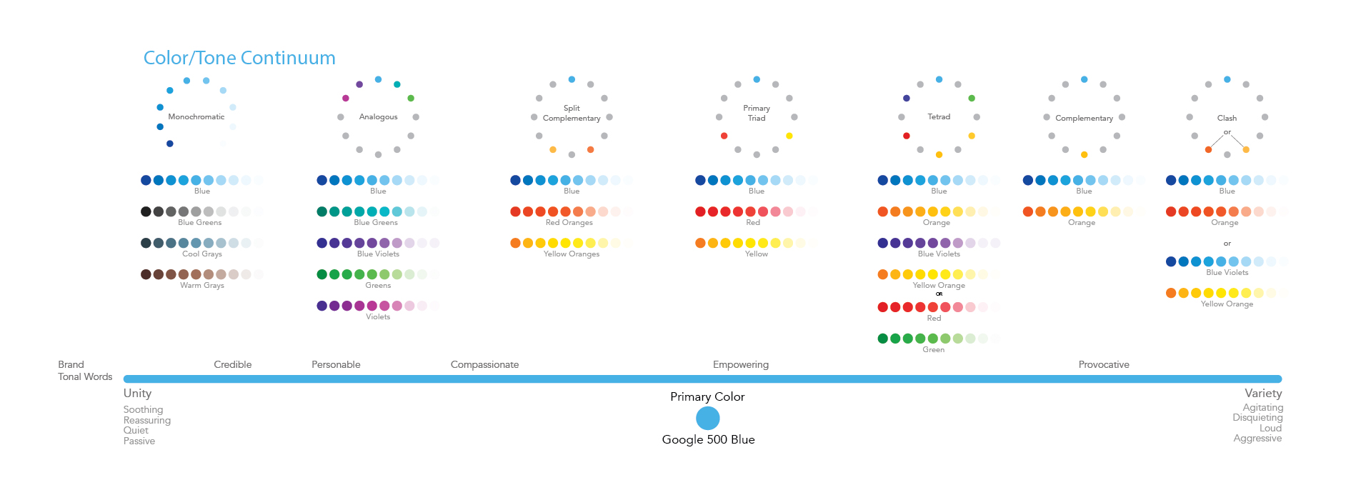
Figure 03 — Color Communication Continuum
The continuum became the foundation for Victory’s color system. Each harmony relationship was chosen not simply for visual balance, but for the kind of experience it creates. Some moments benefit from reducing cognitive load and creating reassurance. Others call for greater contrast, energy and attention. The palette was designed to support both, allowing color to reinforce communication intent rather than simply decorate it.
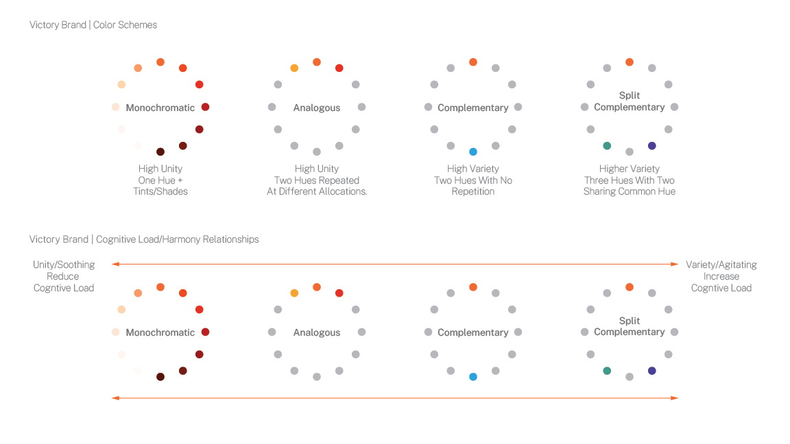
Figure 04 — Color Harmony Continuum
The mechanic is a matter of variety. As additional hues are introduced and the relationships between them grow more varied, visual complexity rises, and that subtle increase in variety quietly raises cognitive activity. Reduce the number of hues and the opposite happens: unity strengthens, complexity falls, and the perceptual experience turns calmer. Victory intentionally adopts four harmony relationships positioned across this continuum, and each was selected because it supports a different communication need. Monochromatic provides maximum unity, used where a person needs reassurance, reflection or sustained reading. Analogous introduces perceived richness while holding strong visual cohesion. Complementary creates stronger energy and naturally draws attention to the moments that matter. Split complementary expands expressive range further while preserving harmony around orange as the governing hue.
Selecting a relationship for the effect it creates, rather than a color for the way it looks, is fundamental to the Victory identity system.
“The question shifts from ‘what colors should we use?’ to ‘what kind of experience should this communication create?’” Color as Communication Strategy
Theory becomes production in the next figure. The palette was deliberately constrained. Rather than assembling a large collection of unrelated colors, Victory builds every communication from a tightly controlled family of related hues.
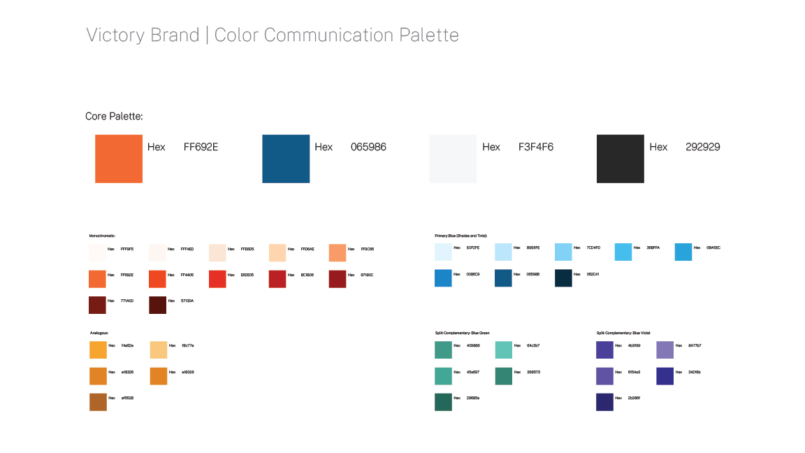
Figure 05 — Communication Palette
Orange governs the system and blue balances it. Blue-green and blue-violet widen the range through split-complementary relationships, and a small set of tints and shades adds flex. Every expansion runs through orange, so the palette grows without losing its center.
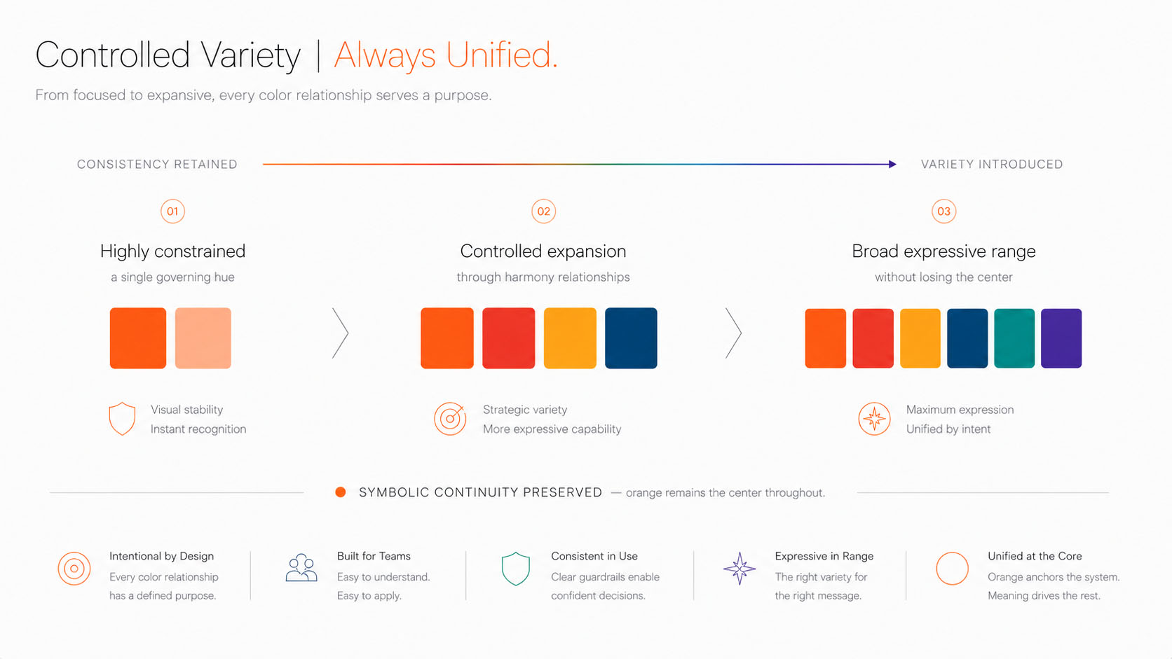
Figure 06 — Controlled Variety
A constrained palette expands expressive capability through intentional harmony relationships while preserving symbolic continuity around orange.
“The balance between consistency and flexibility lets communication remain intentional across many contexts without becoming repetitive or chaotic. Those are the two outcomes brands most often create when color is chosen arbitrarily.” Controlled Variety
The palette was also designed to scale beyond the design team. Because every color relationship has a defined communication purpose, marketers, content strategists and other creative contributors can make informed visual decisions without deep expertise in color theory. Color stops being an aesthetic preference and becomes an organizational communication framework, and creative reviews turn into discussions about message, audience and desired emotional posture rather than personal taste.
“Color stops being an aesthetic preference and becomes an organizational communication framework. Creative reviews turn into discussions about message, audience and desired emotional posture rather than personal taste.” From Preference to Governance
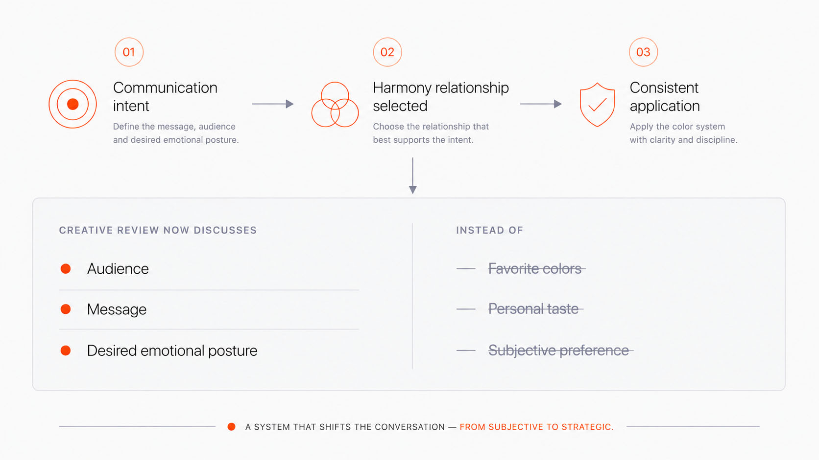
Figure 07 — The Color Decision Framework
A repeatable decision model that shifts creative reviews from subjective preference to communication intent.
This is the governing mechanic. As a scheme moves toward variety, cognitive activity, visual energy and attention all rise; as it moves toward unity, that demand falls and the field turns calm. Because the response is predictable, it can be aimed, which is what let color meet a man with the posture he needed, calm when the content was heavy and energized when a single action mattered.
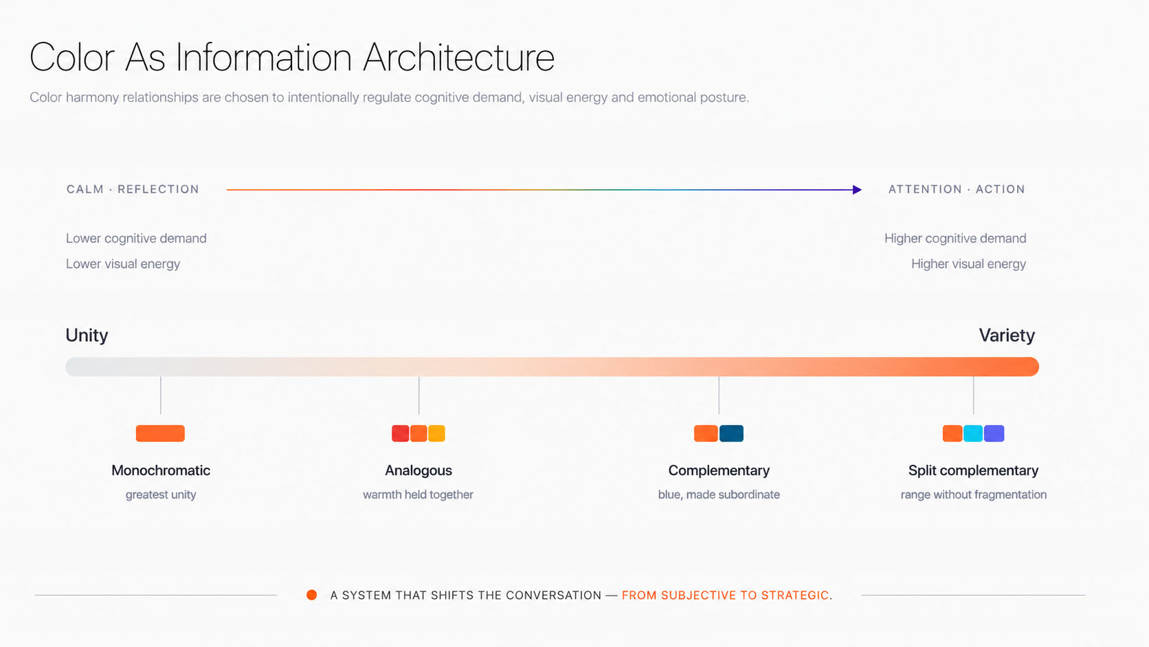
Figure 08 — Color as Information Architecture
Harmony relationships become an information architecture that intentionally regulates cognitive demand, visual energy and emotional posture.
So the four relationships that follow are not arbitrary points on a color wheel. Each is a deliberate position on this continuum, chosen for a distinct effect while staying unified around orange. The framework came first, and the relationships were chosen to fit it rather than reasoned backward from a palette.
Four relationships, one center
The framework came first and the palette followed. Each of the four relationships was chosen to solve a specific communication problem, not to widen a swatch library. Because every one builds from orange, the system can change its behavior without losing its meaning, and because the choice is tied to intent rather than taste, two people reach the same decision for the same reason. A designer is no longer picking a color because it looks attractive. They are choosing a communication behavior the whole team can repeat.
Monochromatic · greatest unity
Monochromatic is the system at maximum unity and its lowest cognitive demand, which makes it the calmest voice Victory has. It is the setting for reassurance and orientation: long-form reading, dense information and the stable interfaces a person returns to when the content is heavy. Holding to a single hue strips out unnecessary visual noise, so nothing competes for attention that has not earned it.
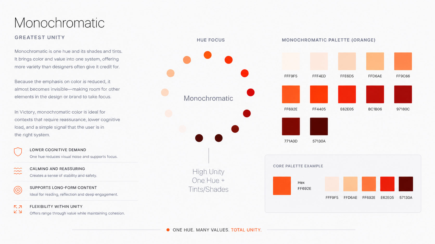
Figure 09 — Monochromatic
Analogous · warmth held together
Analogous is controlled expansion. Bringing in orange’s neighbors adds warmth, emotional continuity and a richer hierarchy while every hue still answers to the same center, so the range grows without the coherence loosening. It is the relationship for moments that need more expressive flexibility and symbolic depth but must stay emotionally stable and unmistakably one brand.
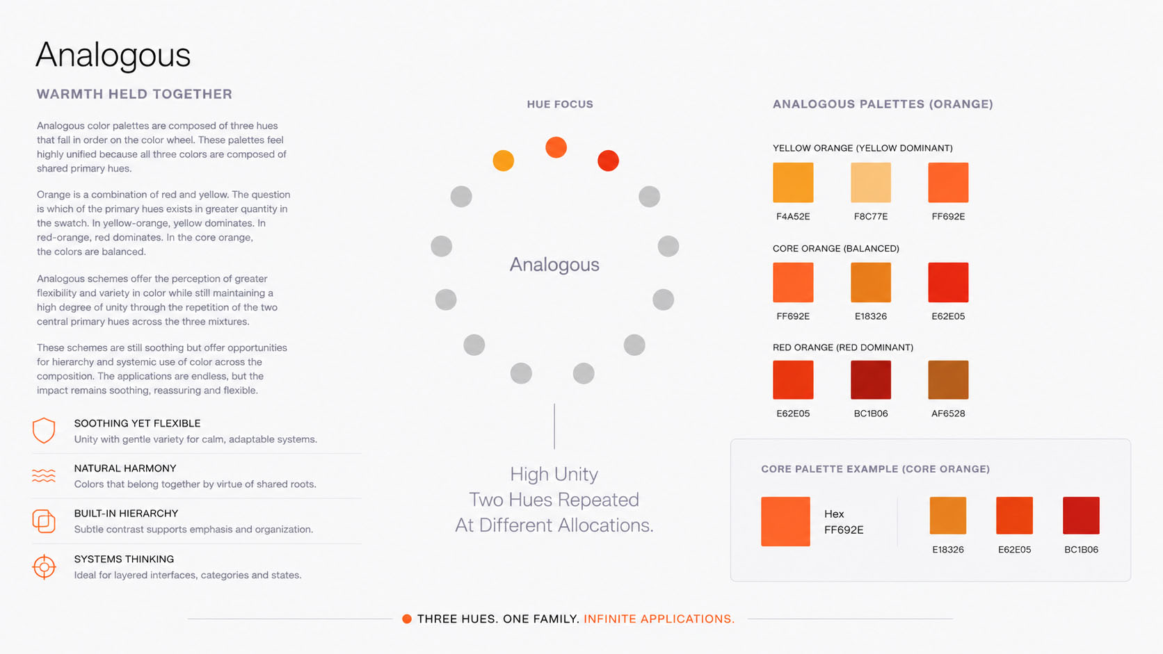
Figure 10 — Analogous
Complementary · blue, made subordinate
Complementary is deliberate tension, used where a message needs to move someone. The contrast creates immediate emphasis and clear directional cues, which is what a call to action or any moment that demands attention requires. Blue exists here because it completes orange, and it stays in that role. Orange remains dominant and blue supports the message rather than becoming the identity, so complementary works as an emphasis tool, never a branding palette.
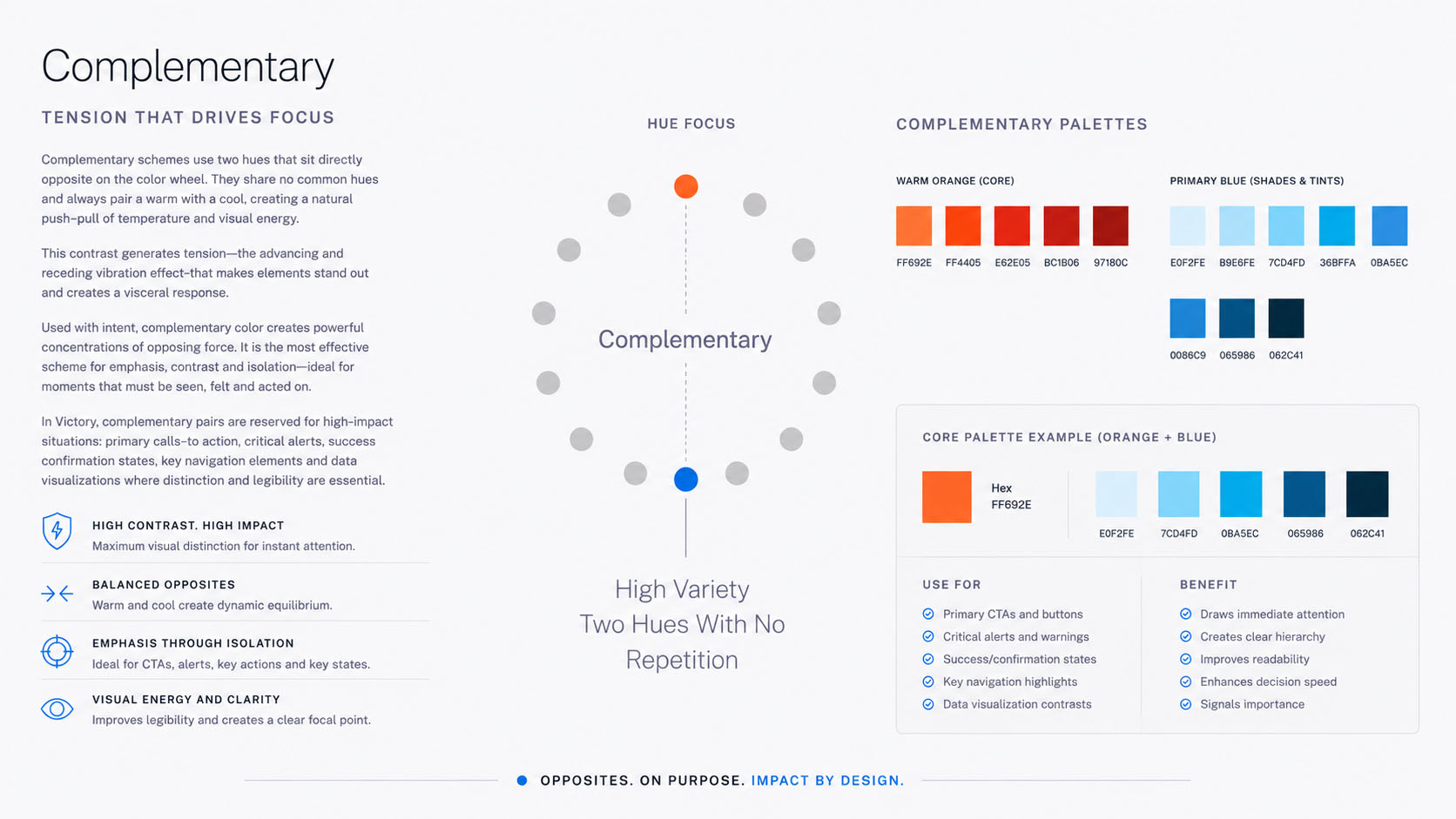
Figure 11 — Complementary
Split complementary · range without fragmentation
Split complementary is where the system reaches its broadest expressive range. Adding blue-green and blue-violet gives Victory the flexibility to build hierarchy and communicate across many contexts while everything stays anchored to orange, so range never becomes fragmentation. This is the logical culmination of the framework: one identity that can meet many communication situations and still read, everywhere, as a single brand.
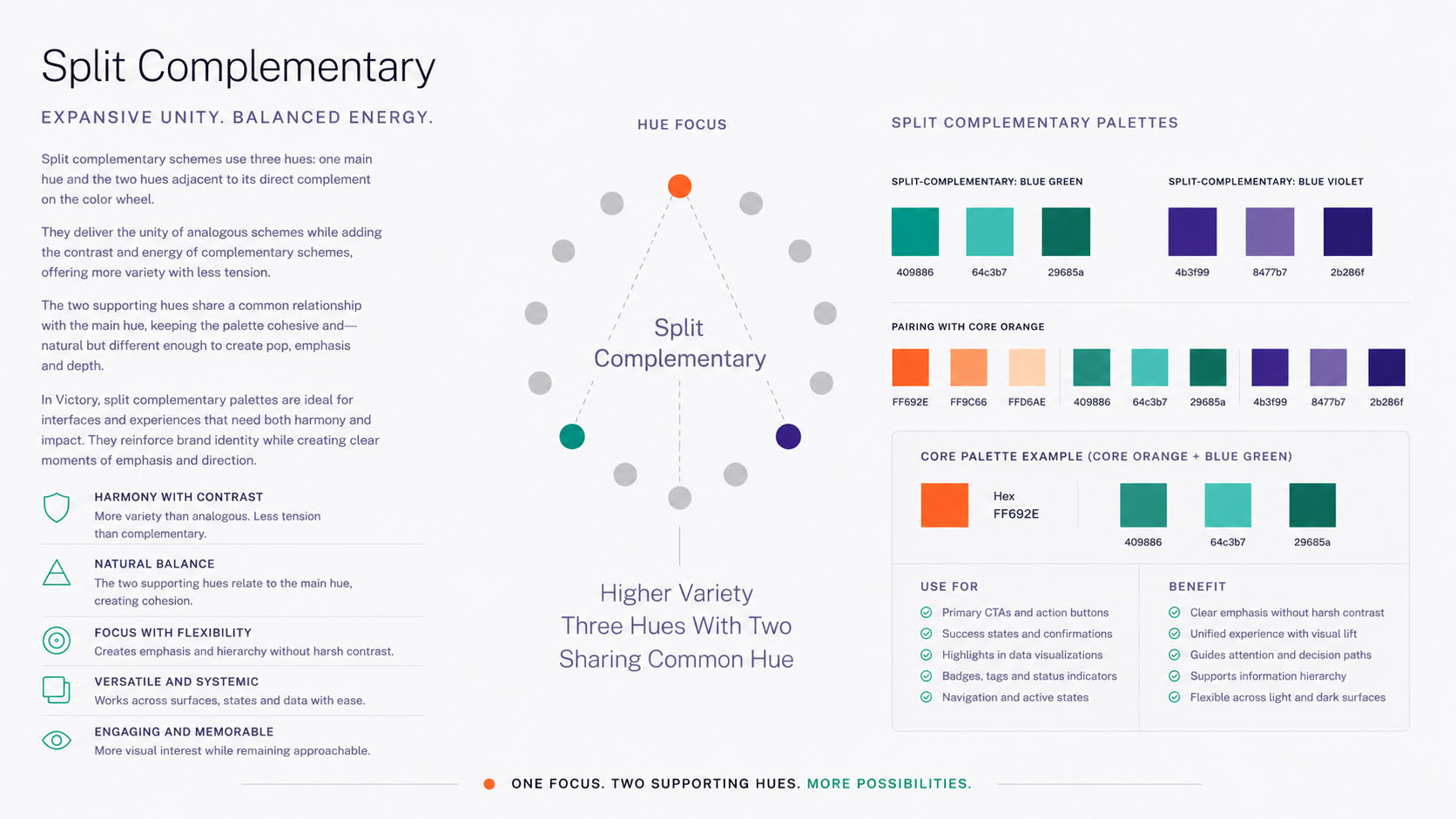
Figure 12 — Split Complementary
A palette you can teach
Only now does the palette itself appear, because only now does it mean anything. The system resolves into a small set of core colors with their tints and shades, plus a short list of support colors.
Forward
Grounded
Calm field
Weight
The restraint is the point. Limiting the number of tactical colors created consistency across teams while still leaving room to flex. A palette this tight is not just usable. It is teachable, which is what matters once the work leaves one designer’s hands.
Figure 13 — Victory Color System
A complete palette built from controlled harmony relationships rather than arbitrary color selection.
“Color does not decorate Victory. It begins telling the story before a single word is read.” Communication, Not Decoration
Seen whole, the color system was never really about color. It was built to communicate on two levels at once. Symbolically, every hue carries the story of becoming, with orange holding the space between warning and arrival so the identity always points toward movement. Viscerally, the relationships between those hues shape attention, emotion and cognitive load before the mind has named a single one. One level speaks to what a person believes; the other decides how they feel while believing it. That is the distance between color as decoration and color as communication. It is also the same discipline the rest of the identity keeps: the logo gives the work its form, typography gives it a voice, and color settles how it is felt. When every discipline reinforces the same idea, the identity stops being a collection of assets and becomes a single system, one already shaping perception by the time the next discipline begins to speak.
What can a picture carry that a photograph cannot?
Most recovery brands reach here for metaphor and overreach. Chains, cliffs, sunrises. The clarity-over-noise pillar rules that out. Illustration stays structural and geometric, descended from the same motif grid as everything else. When an idea needs a picture, the picture is built from the same triangles as the logo, so it explains a concept the camera cannot reach without sliding into decoration.
Illustration borrows the motif vocabulary. It is the symbolic system at a larger scale, never a second visual language. The restraint is not taste. A man who has been sold to for years can smell a metaphor reaching for his feelings, and the moment he does, he stops believing anything else on the page.
What is every image teaching the customer to believe about himself?
This chapter is not about photography. It is about visual testimony. Photography became one medium able to bear witness, and the brand held it to the standard it held everything else. Before a caption is read, an image has already told a man a story about who he is.

Same craft as a lifestyle brand. The consequences are not the same.
An image here carries weight a caption cannot. It teaches. Every image forms someone, and a man in crisis believes what he is shown.
The category fought pornography with pornography's own grammar.
A decade ago the brand's first photography doctrine already had a name for it. Life porn. The flawless family around a spotless computer. The instant after. The restored marriage sold in a single frame. Pornography offers an idealized version of life no one can reach. The imagery built to cure it offered the very same.
Idealized stock imagery is the visual parallel of pornography. Perfection is a lie used to keep addicts enslaved.
Nine years of practice turned the rule into a purpose. Photography is testimony. Its work is to record a real man in real light, so another man can see that freedom is already happening to someone like him and recognize himself on the road.

Teaches him the problem is the machine, not the heart. Promises a cure the software cannot give.

Teaches him recovery is a process he has already entered. Promises another day, the one promise the brand can keep.
Same resolution. Same lighting budget. The only difference is what each frame asks him to believe about himself.
An image is a rehearsal of a self.
Pornography works by rehearsal. It lets a man practice a counterfeit version of himself until the counterfeit feels like home. The category answered it with a different counterfeit. It pictured the man already healed and called that hope. There is a third option hiding in the same mechanism. If an image rehearses a self, let it rehearse the true one. Let a man practice becoming who he hopes to be, on a road honest about the cost, without pretending he has arrived.

Pornography rehearses fantasy. Victory rehearsed virtue.
Nearly every recovery brand rehearses a story the customer already knows is false.
The failure runs deeper than the photography; it lives in the promise underneath. Conventional marketing sells recovery as if it arrived overnight, rehearsing ease to a man who is living difficulty. Credibility drains one frame at a time.

Marketing rarely loses the customer on purpose. It loses him by redefining success. Formation gives way to acquisition, and the easy promise begins to outperform the honest one. The customer becomes easier to acquire, not better prepared.
When people leave, the brand blames the market before asking the harder question: did we tell the truth about the road? Victory measures differently. The work is not done when someone signs up; it succeeds only if he is still walking long after the easy promise has worn away. The image is the symptom. The scorecard is the disease.
The deeper mistake wears the face of kindness. Softening the picture tells a struggling man his struggle is smaller than it is — a quiet disrespect that diminishes the very people it hopes to serve.
Recovery is hard, and the customer knows it in his body before any brand says a word. Trust goes to whoever says so plainly.
Victory never promised an easy road. It promised a road worth walking.
The opposite of fantasy is not prettier fantasy; it is truth. Honor the difficulty and a brand earns belief; edit it away and belief is lost. The comparisons that follow need almost no explanation.

Treat these as evidence. The category did not lack skill. It aimed its skill at attention. Each pair shares a budget, a crew and a lens.


One performs a conversation. The other shows two men who are still walking.


One sells the wound it claims to heal. The other shows the first honest hour after it.


One dramatizes shame. The other shows the resolve that comes after it.


One mistakes a product for a changed life. The other shows the change being chosen.


One promises arrival. The other keeps him honest about the distance.


One manufactures feeling. The other trusts the real one.
Read down the left, then down the right. One forms a man. The other only attracts him.
Everything in the chapter sits beneath two duties.
Bear witness
An image is evidence before it is anything else, and its first duty is honesty. No manufactured aspiration. No engineered emotion. No exaggerated struggle. The question is never whether a camera or a model was used. The question is what the image asks a person to believe. The man reading it has already been failed by systems, by promises and by himself. He will not trust an image that asks him to believe one more fantasy.
Orient the pilgrim
An image is also a guide. It tells a man where he stands, where he has come from and what kind of step comes next. A photograph that only illustrates the copy has wasted its turn to speak. The camera is another storyteller, and on this road another guide.
The question is never whether the image is real. It is whether the image is true.
Storytelling emerged from a handful of choices, repeated until they meant something.
None of these is a technique borrowed for effect. Each is a recurring decision that lets an image speak before the words do. Read one frame, and the decisions are all there at once.
 1
2
3
4
5
6
7
1
2
3
4
5
6
7
The road is not scenery and not atmosphere. It is the visual equal of the Reforging Road.
This is not a hike, and the pilgrim is not exploring. He is crossing a desert while thirsty for the one thing that would send him back to the start. Read in order, these frames are the emotional geography of that crossing.






The desert does not relent. What changes is that the pilgrim stops walking it blind. Guidance appears, and with it the first evidence that the road has been crossed before.






The road never becomes easy. It becomes clearer. He does not arrive in any of these frames. He continues, and on this road continuance is the whole of the victory.
The CompanionThe road is mostly walked alone, and the photography honors that. Roughly two frames in three hold a solitary pilgrim. The third makes room for a Companion, another traveler who has crossed this stretch, present only at the moments that earn it. Water shared at a waypoint. Two men sitting after a hard climb. Listening, and saying little. Walking on together after a setback. Never staged accountability. Never the group photo. Only a man faithful enough to keep walking beside another.
Movement through the frame sets an expectation before a single word is read.
The brand's first doctrine drew this from film. A figure entering from the left reads as the protagonist. The same figure pressed against the reading reads as a man losing ground.

Enters from the left and moves with the reading. He registers as the protagonist, gaining ground.

Pressed against the reading. He registers as resistance, temptation or retreat.
The grammar is a tendency and never a rule. Tension is cheap to add and costly to a man already carrying all he can, so the brand spends it as if it costs something, because to him it does.
The photographs establish the visual language. The Design Grammar chapter takes it further, examining how composition, camera position, body language, orientation, gaze and movement work together to tell a truthful story before a single word is read.
Cover the logo. One set could sell anything. The other could only be Victory.




Interchangeable by design. Sold again to the next brand that needs a feeling.




The same grammar in every frame. One author, recognizable without a mark.
Authorship came from recurring narrative decisions, never from filters or presets. A man who has been marketed to his whole life can feel the difference between an image rented to sell him and an image made to see him. On this road that difference is the difference between a guide he trusts and one more brand he scrolls past.
the road · movement · distance · morning light · negative space · restraint · silence · hope
Victory's images were never made to document recovery. They were made to rehearse it, one honest frame at a time.
The same discipline that questioned the category's assumptions about shame, about the product, about the customer questioned its assumptions about the picture on the wall. Truth first, then direction. A man becomes, in part, what he is given to look at.
A brand is not judged by the photographs it makes, but by what those photographs quietly teach the people who see them.
Photography was never decoration here, and it is never decoration anywhere it is taken seriously. It is strategy made visible. Every frame instructs the person looking at it in how the brand regards him, whether he is a problem to be managed or a person to be seen. The camera has no neutral setting. It either confirms what the brand claims to believe or it quietly exposes the claim as marketing. Composition, light, environment, the choice of who appears and who is left out, and above all the restraint in what is withheld, all of it speaks before a sentence is read, and is believed more readily than the sentence.
What set this work apart was not talent or budget. It was that the Reforging Road was never merely something to be photographed. It became the reality that governed every photographic decision, the standard a frame had to answer to before it earned its place. A system built this way does not depend on the single arresting image. It depends on principles coherent enough that a hundred different hands produce work belonging to one author. Beautiful photographs are common, and mostly forgettable. An authored system is rare, and unmistakable.
This is why photography cannot be left to sit politely beside the other disciplines. It has to reinforce them. The way a brand writes, the way it draws, the way it behaves when a man goes quiet, all of it should be legible in the photography as well, each discipline strengthening the others through their reinforcing fit rather than competing for the eye. And when a photographic decision is in doubt, the question is never which frame is preferred or more admired. It is which one is more true. That is the whole of creative discernment: the willingness to be governed by truth rather than taste.
Learn to read photography this way and the old way of seeing it closes behind you. A picture on a wall is never only a picture. It is an organization telling someone who it believes he is, and asking him to believe it too. The only question worth asking of any image, in any company that hopes to be trusted, is whether that is the truth.
What level of abstraction keeps even the smallest mark inside the system?
Icons usually arrive as a bought set with no relationship to the brand. A thousand interfaces share the same magnifying glass. Journey's icons are generated from the triangle unit and the grid, so a settings glyph or a progress marker belongs to the same family as the logo and the motifs. Function never breaks from meaning, even at sixteen pixels.
Iconography is the motif system doing quiet, functional work, the same grammar scaled down to a control. He never notices it, and that is the mercy. A man at 2am with his defenses gone has nothing left to spend on decoding a screen, and an icon that makes him stop to think has already taken what little he had. The icons inherit the same angles and proportions as the type and the mark, so even the smallest control was drawn by the same hand as everything around it.
What visual structure could reinforce the story without becoming decoration?
Victory's visual language is meaning distilled into shapes, built from one unit on a grid so that complex forms carry meaning without explanation. That unit is the triangle: the smallest unit of intentionality, a single act of choice, the first honest turn toward recovery, a beginning before momentum exists. Everything grows from it. Understand the shape and you understand the system before you see a single finished artifact.
- 1Triangle. Direction, tension, movement, the trinity and the relationships at the core of the service. Right is forward motion; up is ascent and aspiration; down is weight and humility; up-right is growth over time.
- 2Cluster. Triangles grouped into a triangle: trinity, fullness, communal strength, divine order. Equal spacing reads as harmony; one leading reads as sending or leadership.
- 3Pairing. Two same-direction triangles, one leading and one following: discipleship, accompaniment, not alone on the road.
- 4Opposing. Two triangles tip to tip: tension, choice, the encounter between temptation and truth. The gap is the meaning.
- 5Chevron. Triangles resolved into a chevron: a reinforced next move, momentum. Doubled it accelerates; left-facing it reflects.
- 6Directional field. A chevron extended into a plane: movement from a place of security, a stable foundation for a confident decision.
- 7North mark. An upward cluster stronger than all others: true orientation, fixed moral north, guidance amid confusion.
- 8Broken pillar, threshold, disturbed field. Change of perspective, the sobriety line, the temptation event. The system can describe relapse and crossing, not only progress.
None of these shapes is decorative. Each is the doctrine made visible. A single choice, accompaniment, the decision point, momentum, true north. The system has nearly infinite range and never loses clarity, because every form descends from the same idea.
The triangle and the diagonal grid beneath it are not construction conveniences. They carry the doctrine in their geometry. Three points hold the three roles: the Guide, the Companion and the Pilgrim. Behind them stand the Father, the Son and the Spirit. The same shape falls, turns and rises, which is descent, vertex and ascent. Anything built on this grid inherits those angles and that movement, which is why the other disciplines feel related without being matched. A motif laid over a post, a module or a navigation marker is not ornament. It is a second voice, saying what the words are about to say a moment before the reader reads them.
What rules let one shape scale to a whole system without losing the story?
The grid is the underlying structure that keeps proportions and angles consistent while letting the system scale from a single triangle to a full composition without breaking. The rules that ride on it are not arbitrary craft preferences. Each one is the doctrine, repeated.
- 1Direction. The composition leans forward, because the doctrine always points to the next step.
- 2Repetition. The same forms recur, because change happens through consistency, not moments of willpower.
- 3Rhythm. Even spacing reads as steady momentum; widening spacing reads as growing speed.
- 4Negative space. Generous room to breathe, because the audience is overloaded and the pillar is clarity over noise.
- 5Contrast. Saved for the one thing that needs action, so attention is spent where it earns its keep.
- 6Hierarchy and scale. One thing leads, always pointing to the next move, never the whole map at once.
These rules are the current expression, not the law. The law is underneath them. Victory protects the reasoning, never the artifact. The logo, the typefaces and the palette on these pages are not sacred. The truths they carry are. When a new decision arrives it is judged by one question, whether it is more truthful, never whether it is preferred. Principles outlast every expression of them, which is what lets the identity change without losing itself.
What does the brand believe, whether or not it ever says it?
Core convictions about the problem, the customer and the solution. They hold whether or not the brand says them out loud. They set the stance and force the tradeoffs. They decide what the brand builds, what it refuses to build and how it stays distinct. Journey renders every pillar as a road the man is already walking.
Each "over" is a refusal, the thing Journey will not do, written down. Pillars force tradeoffs, which is why they are internal truth and never marketing. A pillar that costs the brand nothing is decoration. These cost it the easy promise, the bigger market and the faster sign-up, which is how you know they are real.
How should the brand act when the moment is hard?
Identity here is how the brand acts, the patterns of tone, posture and response in any situation, above all the hard ones. A relapse. A silence. A man who goes quiet. These are behaviors the system performs, never adjectives on a wall. The brand does not claim them. It performs them.
A personality can be described and ignored. A behavior has to be performed every time, by every writer, in every channel. Defining identity as behavior is what lets a brand stay itself across a hundred hands. A man scanning for the moment we drop the act will find it the first time a behavior lapses, and he will be gone before he can be talked back. Behavior is the only identity that survives contact with him.
How should language reinforce becoming instead of shame?
The essential ideas the brand repeats, so the market understands its value and why it matters. They come from the pillars, though not every pillar becomes a message. They set what to emphasize, what to leave out and how understanding builds over time.
- 1Victory changes who you are, not just what you do.
- 2You are responsible for change, but you are not left to do it alone.
- 3Faith is not added; it is leveraged as a source of strength.
- 4Where you are heading is more important than where you've been.
- 5Change happens through consistency, not moments of willpower.
- 6Real accountability is relational. Technology makes it visible.
- 7Slips don't disqualify your progress.
- 8Real change happens as you become strong and resilient.
- 9This is about who you are becoming, not just what you stop.
- 10Accountability is what makes lasting change possible.
Repetition is the mechanism. The market learns the brand by hearing the same few truths until they become its own. A man carrying this much does not learn quickly, so the few true things are chosen, ranked, held and said the same way until they become his own. Improvisation is a luxury for an audience that is not exhausted.
How should Victory speak if accountability really is an act of courage?
The voice does the emotional regulation in words. It stays close to the man and never speaks from a distance. It names what is real, even when that is hard, because clarity is what moves people forward. And it points to the next step, because no one moves by standing still.
"I am with you. I see clearly. And I'll help you take the next right step so you can stay on the road." Every expression is built to produce that feeling first. The design carries the posture. It does not decorate the message. Language is where he decides whether we have walked this road. One false note. One borrowed phrase. He knows in an instant we have not.
"You don't have to see the whole road. You just have to take the next step."
"You are further than you were yesterday."
What words become impossible once the strategy changes?
The same idea, said two ways, can shame a man or steady him. So the vocabulary is governed. Some words build the identity Journey invites. Others quietly rebuild the old one. The rule follows the doctrine. The language of becoming replaces the language of escaping.
Vocabulary is the pillar Responsibility Over Shame made literal. Ownership, without an identity built on failure. The wrong word here does not read as a style slip. It tells a man who already suspects he is the problem that we agree with him.
How does the whole system sound in the words a customer actually reads?
Everything above resolves here, in the lines a customer reads. Headlines and CTAs inherit the fixed core. Call out reality, then point forward. Clear action, forward movement, no friction. A guide offering the next step, never a brand asking for a click.
Every line, from a billboard to a 2am notification, is the same voice doing the same job. A man deciding whether to trust us cannot afford to wonder who he is dealing with, so we never make him guess. He meets one brand, never a committee.
Applications
Applications come last on purpose. Seen before the reasoning they look like decoration. Seen after it, they answer the last question. Does the identity hold its shape across every surface a customer touches?
- 1North Mark on the steps. Triangles point up and to the right along the sight lines of a staircase; a soft-light transparency suggests clarity and guiding warmth; the complementary palette ignites action at the start of recovery. Something small, planted at the base of the steps, given the energy to begin.
- 2Opposing triangles + broken pillar. The diagonal of the broken pillar signals a change of perspective; the staggered opposing triangles mark a decision point and two directions. The white space between shapes becomes a path through obstacles: you aren't avoiding something, you are moving toward a new life.
- 3Disturbed field + triangle pairings. A solid triangle as the hero, a hollow one as the ally. A rhythmic line of dark triangles tries to push them back toward complacency, and the hero holds in steady repetition. It carries the truth that repetition over time is what brings Victory.
- 4Threshold line + circular V frame. The user is asked to face something long avoided, and a monochromatic scheme is the balm. The threshold line divides old from new. The V frame funnels attention to the door, and change begins when he reaches out and unlocks it.
Every application has to do three things at once. Feel like the posture, behave like the identity and speak in the voice. When it does, a customer never has to be told the rules. He feels them.
A reader who has followed the reasoning this far may arrive at a fair question. If the diagnosis was this precise and the strategy this disciplined, why did the expression land on a road, a metaphor the category and the wider culture already know well? It is the right question, and the answer is not that an argument was lost or that ambition ran out. The answer is a principle that governs all serious creative work.
Creative leadership never operates in open air. It operates inside constraints. Technology has limits. Organizations have alignment, history and momentum. Implementation has complexity. Categories have gravity. Influence is distributed across many hands, and execution capacity is finite. These are not excuses reached for after the fact. They are the conditions every real decision is made within, and a strategist who ignores them is not being bold. He is being naive.
So the strongest expression is rarely the most imaginative one conceived alone in a quiet room. It is the strongest truthful expression an organization can genuinely understand, build, carry and sustain over years. An idea no one can implement is not a strong idea. An idea that cannot survive a hundred hands and a dozen quarters is not a strong idea, however striking it looks on a single slide. Strength includes the capacity to be lived by the people who must live it.
This is what it means to begin with reality, not with wishes. A diagnosis is only honest if it includes the people who must act on it, and a guiding policy is only sound if the coherent actions it demands can actually be carried out. Creative discernment asks the same thing at the end. An expression is judged inside the world it has to live in, never in a vacuum. The road was chosen because it was the most truthful idea this work could become, and because a familiar shape, made rigorous, reaches a tired man faster than a clever one he has to decode.
That is the discipline worth respecting in any creative leader. Not the nerve to imagine the most original thing. The judgment to find the most truthful thing that can be made real, and to make it so well that its familiarity becomes an asset and never a compromise. The measure of the work was never how far it departed from what people knew. It was how honestly it served the person walking the road.